Design Systems
Vertabase Design System
Vertabase is A scalable, token-driven design system built for Vertex Software Corp (a development agency), aimed at establishing reusable patterns and components to reduce dev handoff friction, help the team ship designs faster, giving every client project a tested starting point.
- Client
- Vertex Software Corp
- Scope
- Foundations, components, patterns
The Problem
As an agency, Vertex Software Corp designs across many industries and clients. Without a shared foundation, every new project meant rebuilding the same decisions from scratch: which grey colour to use, how to express error and success states, which type sizes to pair. That led to three recurring issues:
- Inconsistency between projects and between designers on the same project
- Slow starts, because the first days of every engagement went to setting up styles
- Messy handoff, because values were hard-coded and not mapped to anything developers could reuse
The Goal
Create one foundation that works as a starting point for any project while staying flexible enough to be themed for each client and the system needs to be:
- 01Tested, refined across real projects rather than designed in isolation
- 02Token-based, so a single change cascades everywhere
- 03Documented, so anyone can pick it up without asking me
My Approach
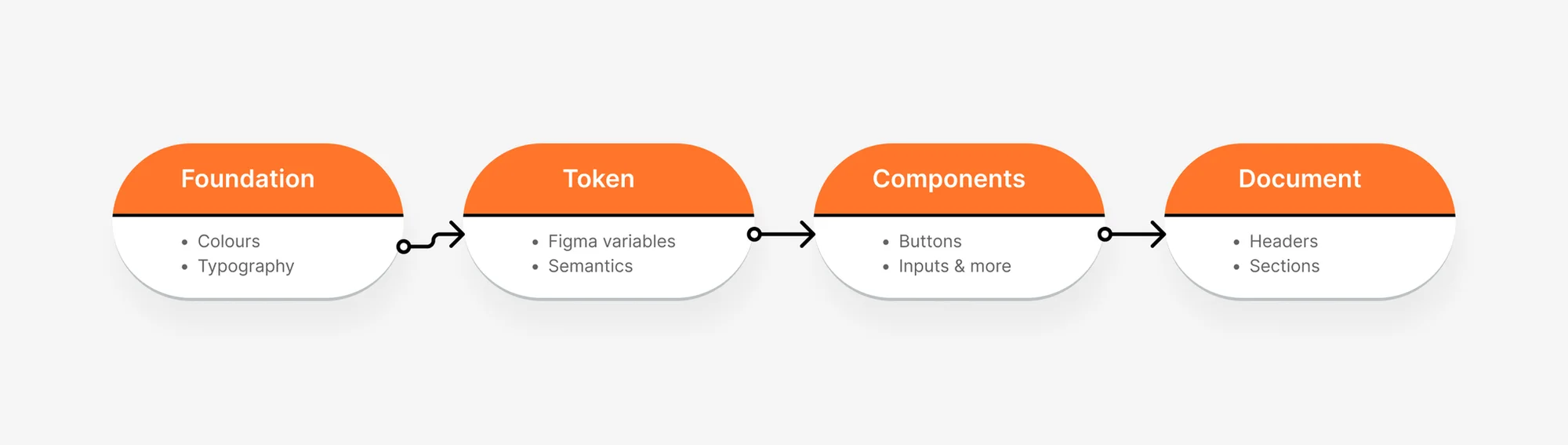
Foundation
01. Colour
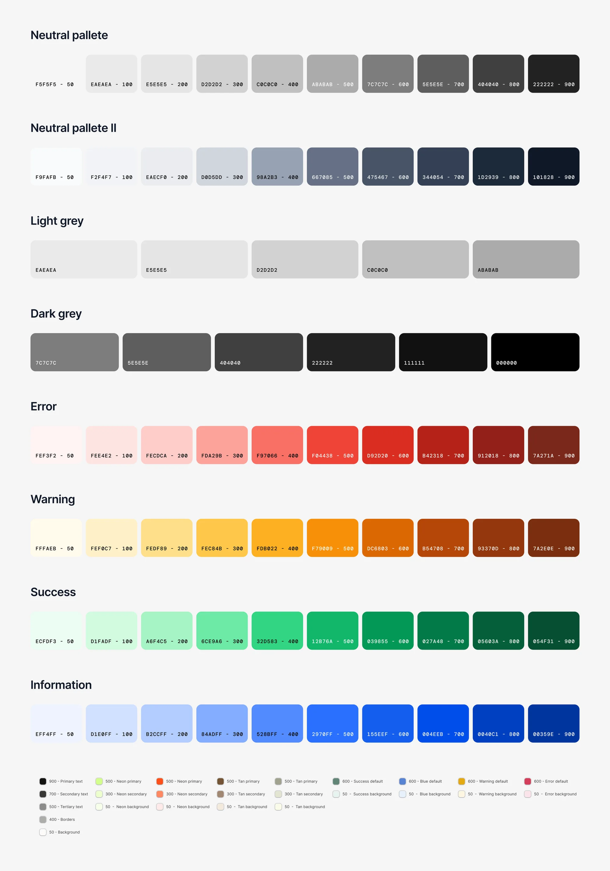
The colour page organises the palette into clear families, each on a 50 to 900 scale so designers always have a lighter or darker step available for states, borders and backgrounds.
Gradients. Error, warning and success each have paired gradients (500 to 700, 600 to 800, 700 to 900), plus a set of image-based gradient backgrounds for hero areas and feature cards.
Documentation. Every swatch card shows its name and hex value, and the page uses one repeatable layout (header, divider, sections), so new colour families can be added without redesigning the page.
02. Typography
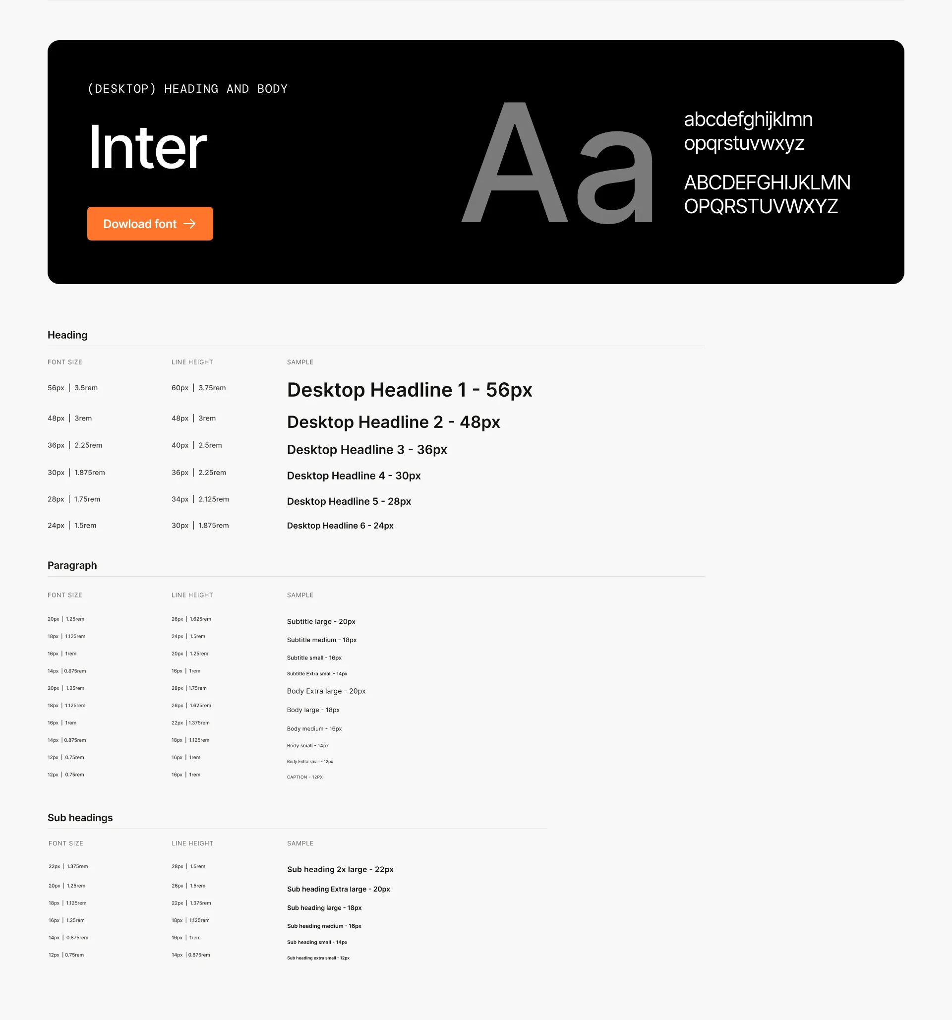
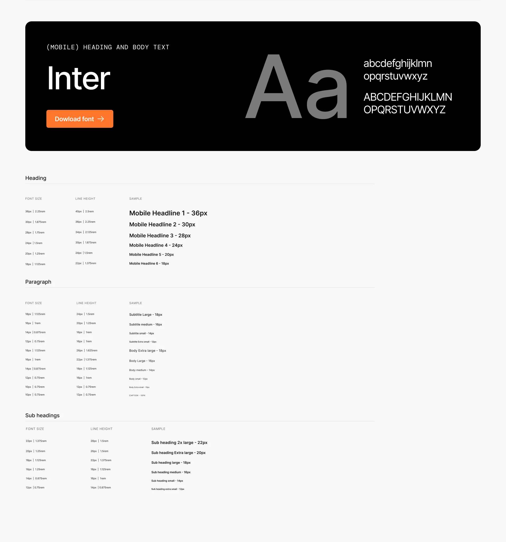
Inter for body copy, set as tokens for size, weight and line height (for example, Body/md/Regular at 16 / 24). Font size, weight and family are all Figma Variables, so type can be re-themed per client
03. Spacing & grid system
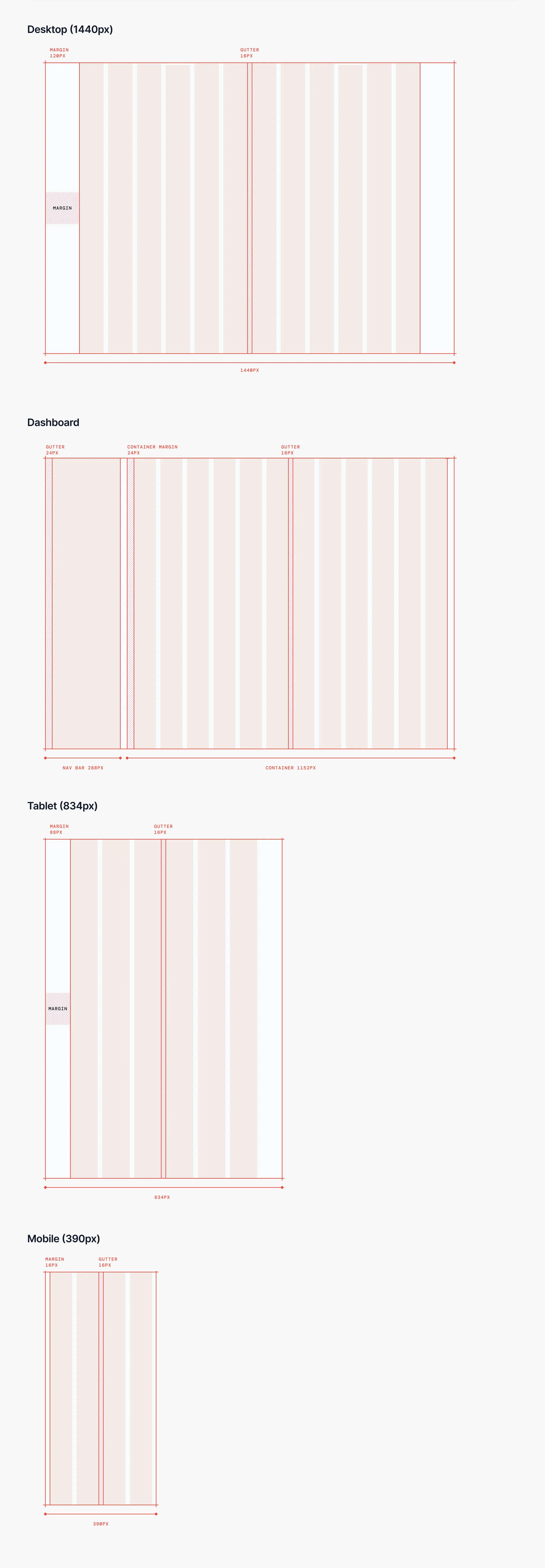
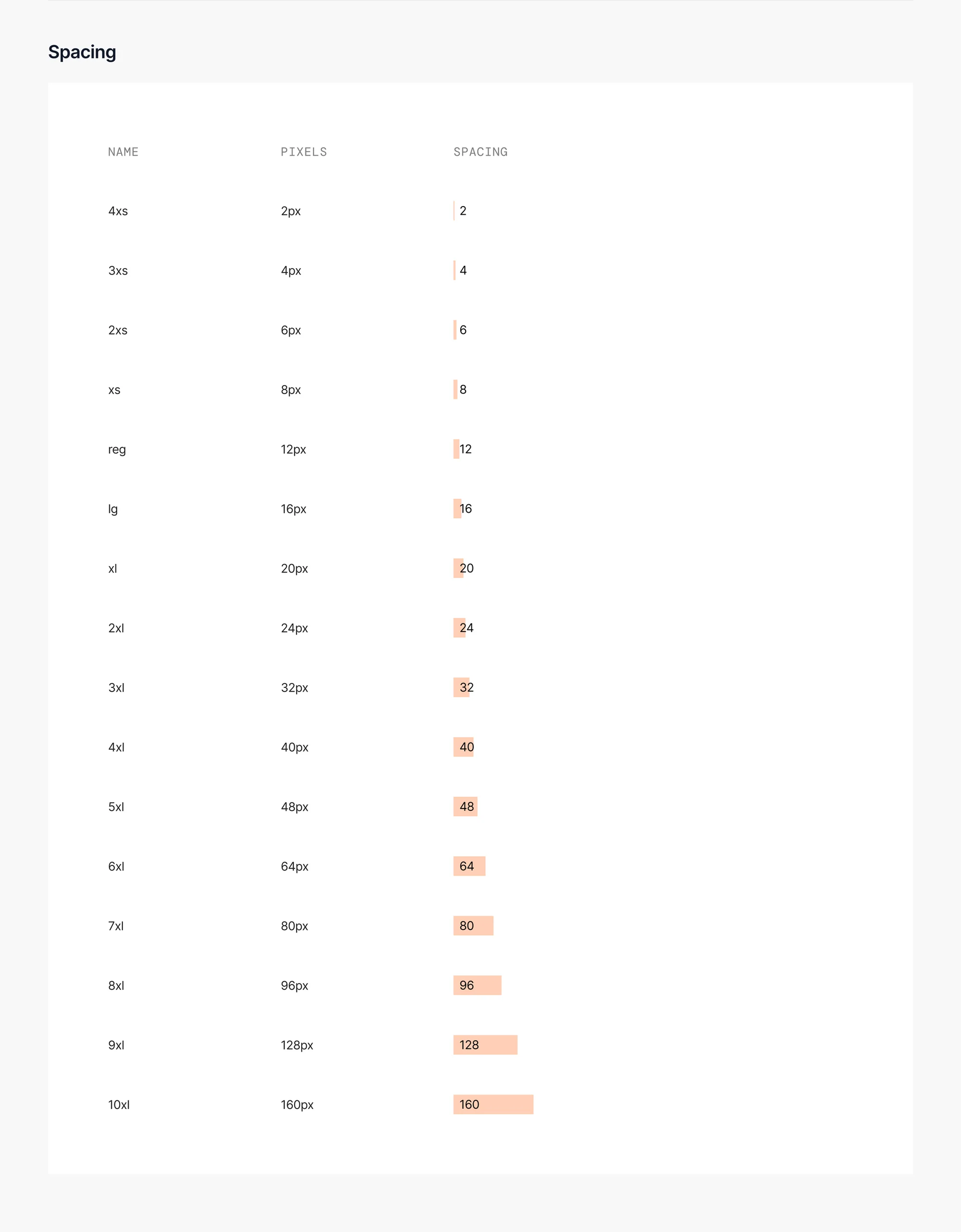
The vertabase spacing system defines consistent spacing and layout rules across Vertex handled projects. It standardizes padding, margins, and component spacing to improve scanability in dense UI like dashboards and forms, and helps design and engineering build faster with fewer one-off decisions.
04. Elevation
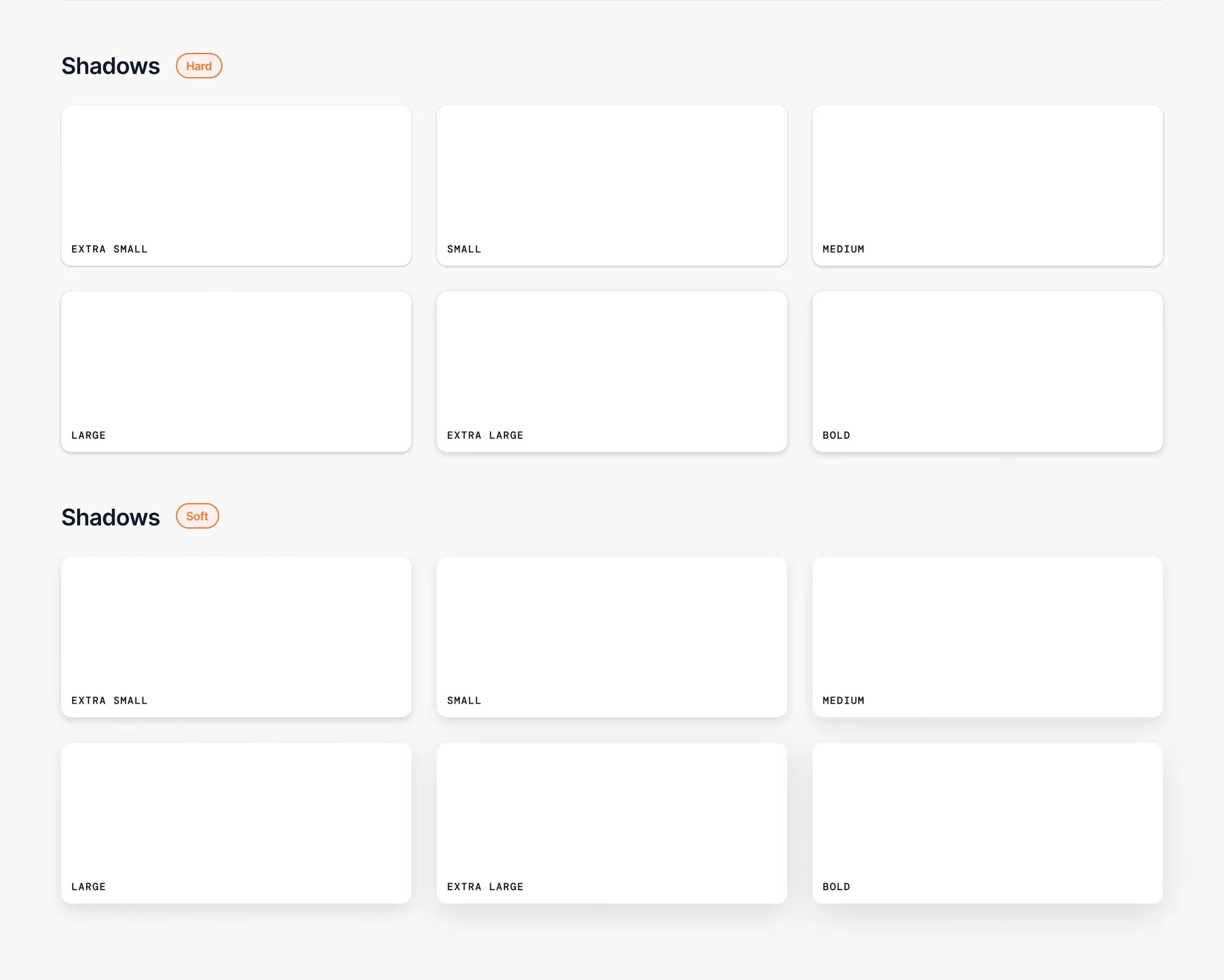
Standardizes shadow levels to communicate hierarchy and focus (modals, dropdowns, sticky elements) in a predictable way.
05. Iconography
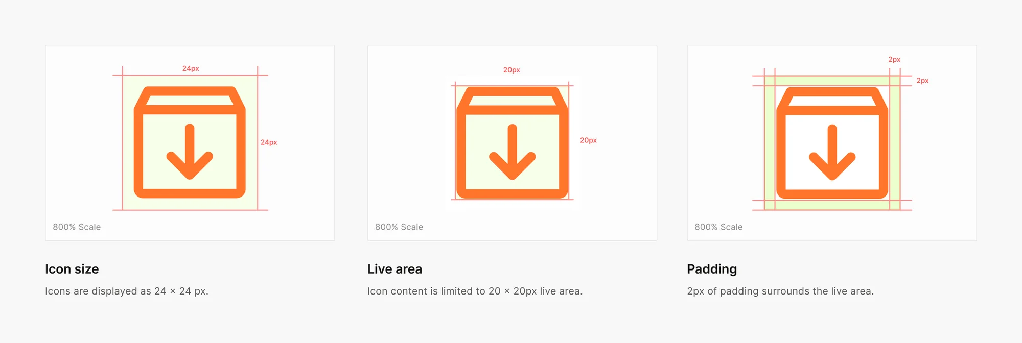
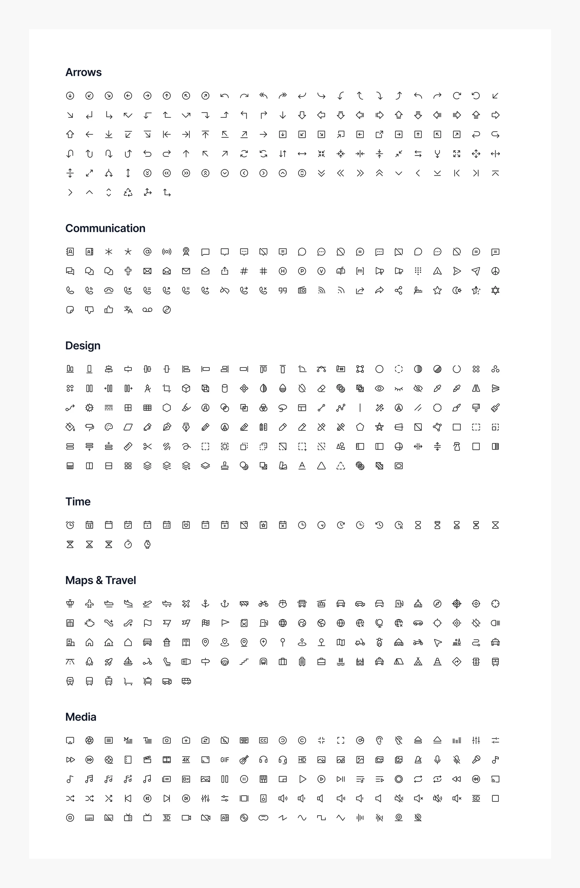
Sets clear icon sizing and usage so actions and status cues stay recognizable and consistent across projects.
Components
06. Buttons
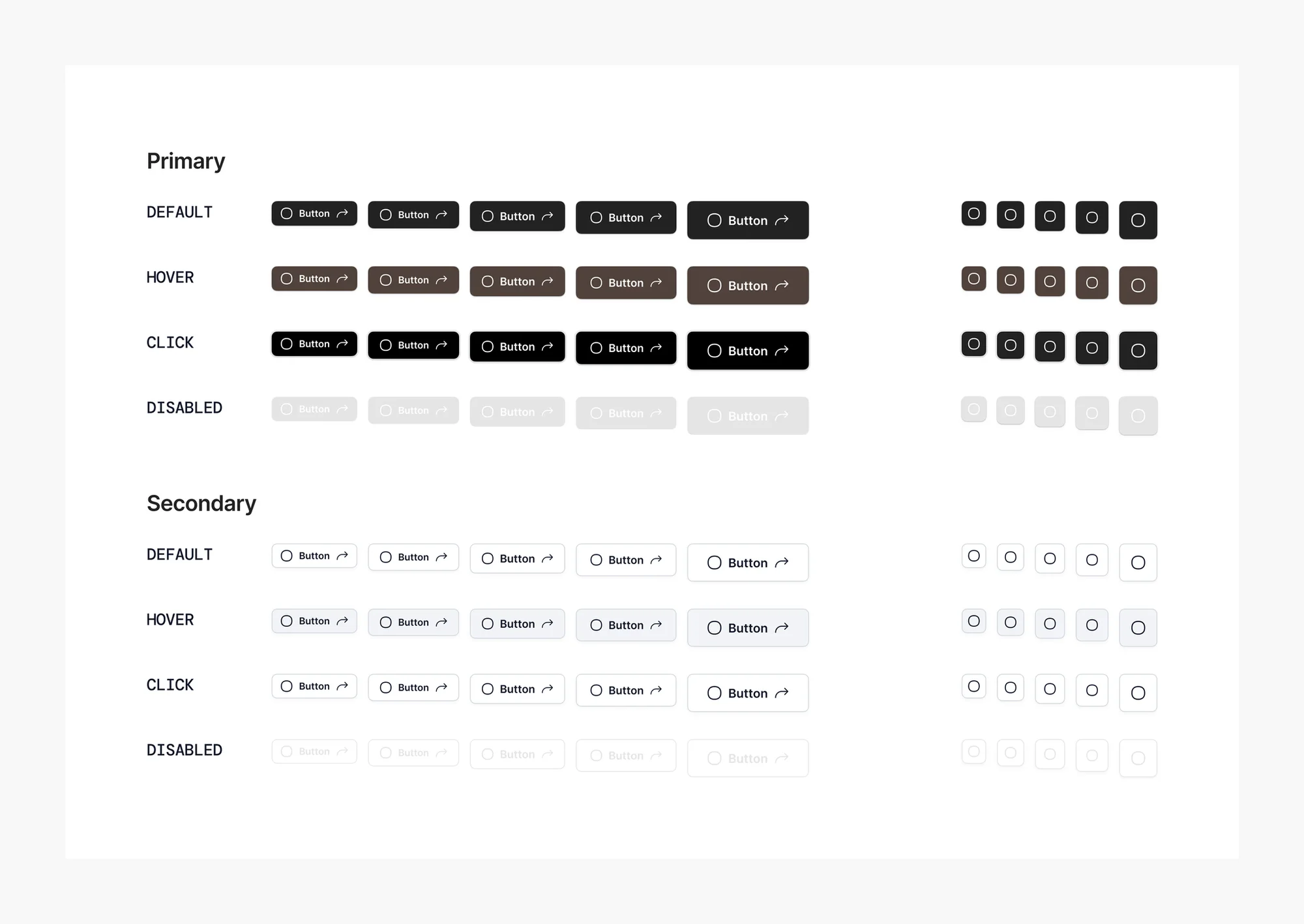
In Vertabase, buttons are the core interactive component used to trigger actions or change the state of an interface. They show up across the entire system; from forms and initiating searches to toggling settings and navigating between pages.
07. Inputs
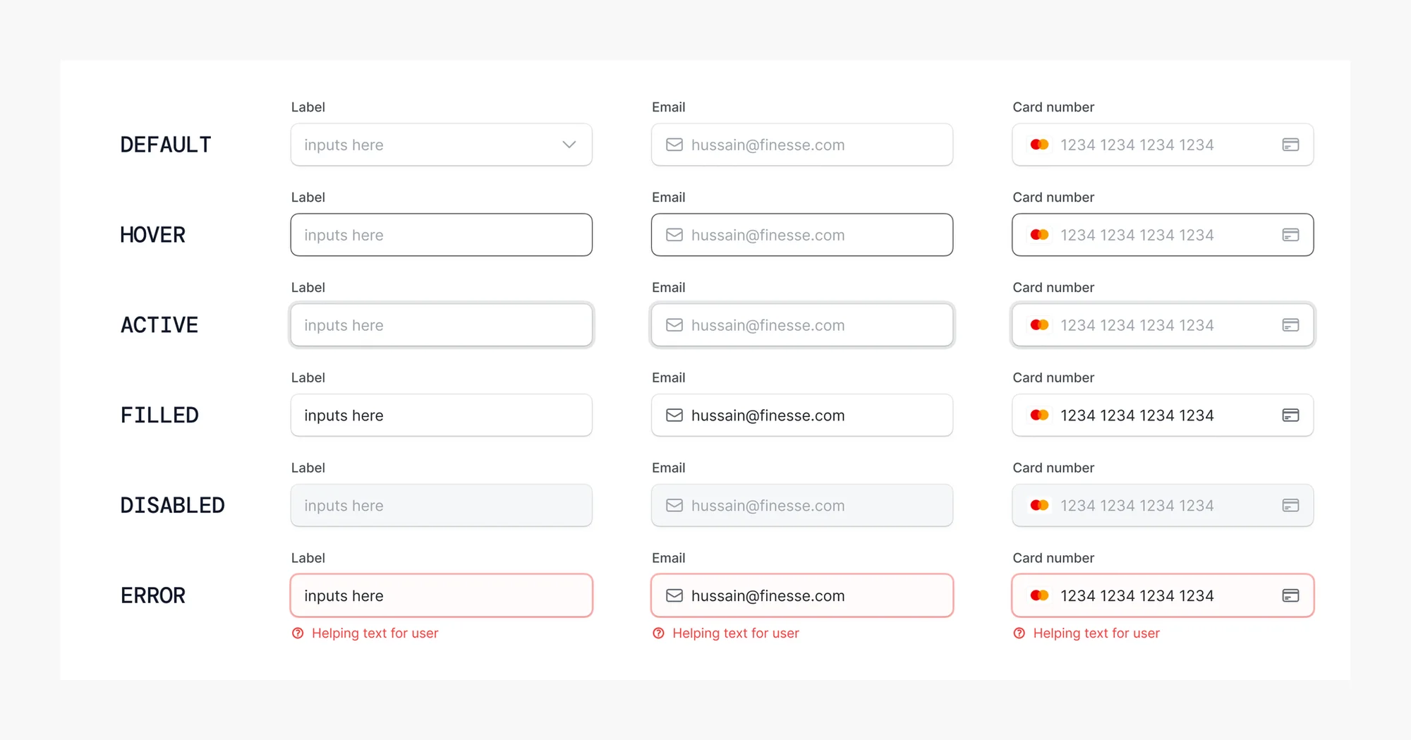
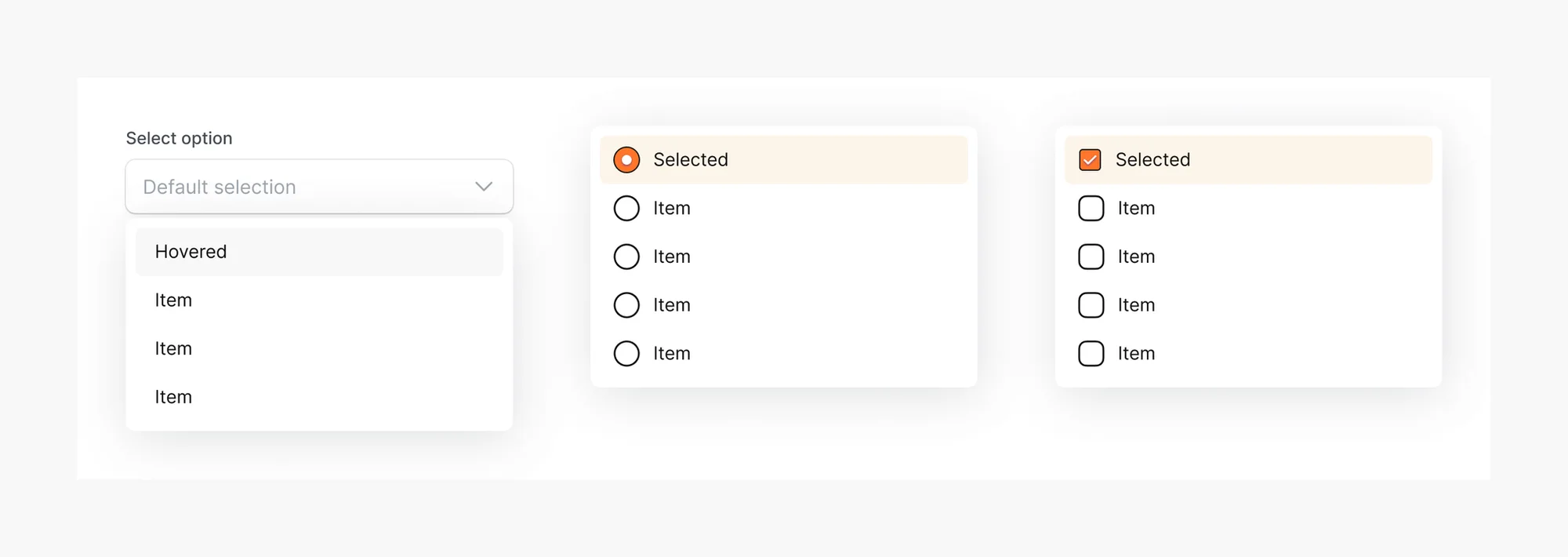
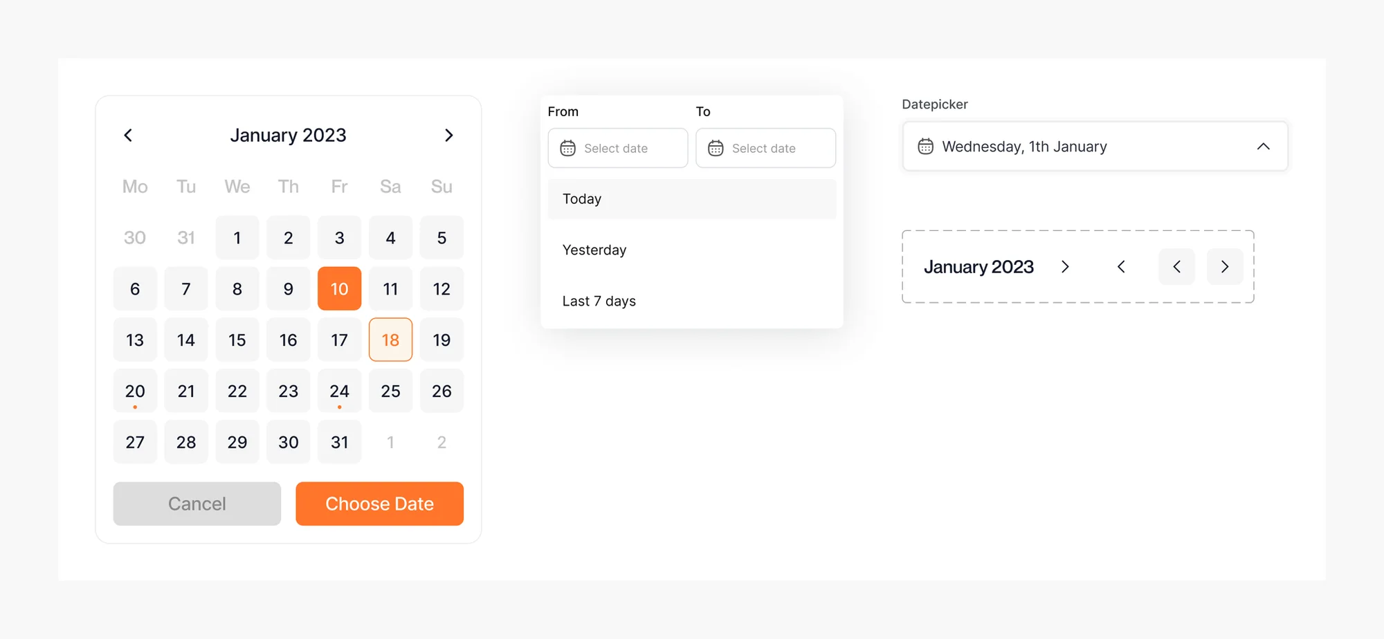
Creates consistent form fields and validation patterns with clear, predictable states across focus, filled, error, and disabled. This makes form interactions easier to understand, provides clearer feedback, and reduces friction throughout form-heavy experiences.
Dropdown
Calendar
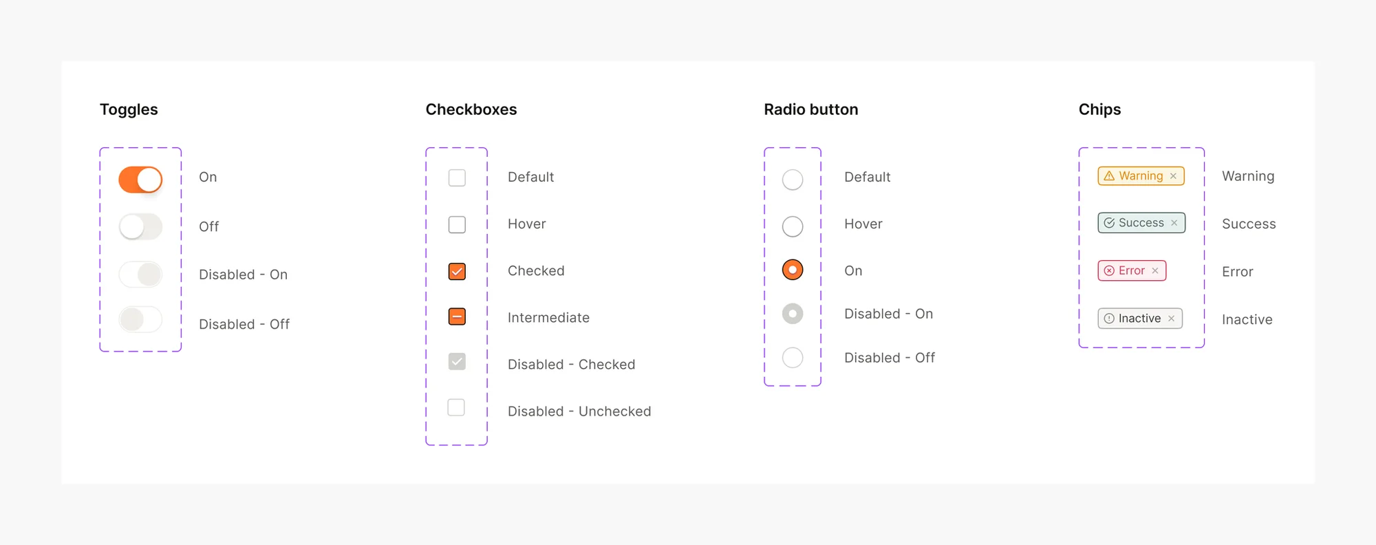
08. Controls
Consistent toggles, checkboxes, radios, and selectors so selection behavior feels familiar and reliable everywhere.
Patterns
09. Alerts
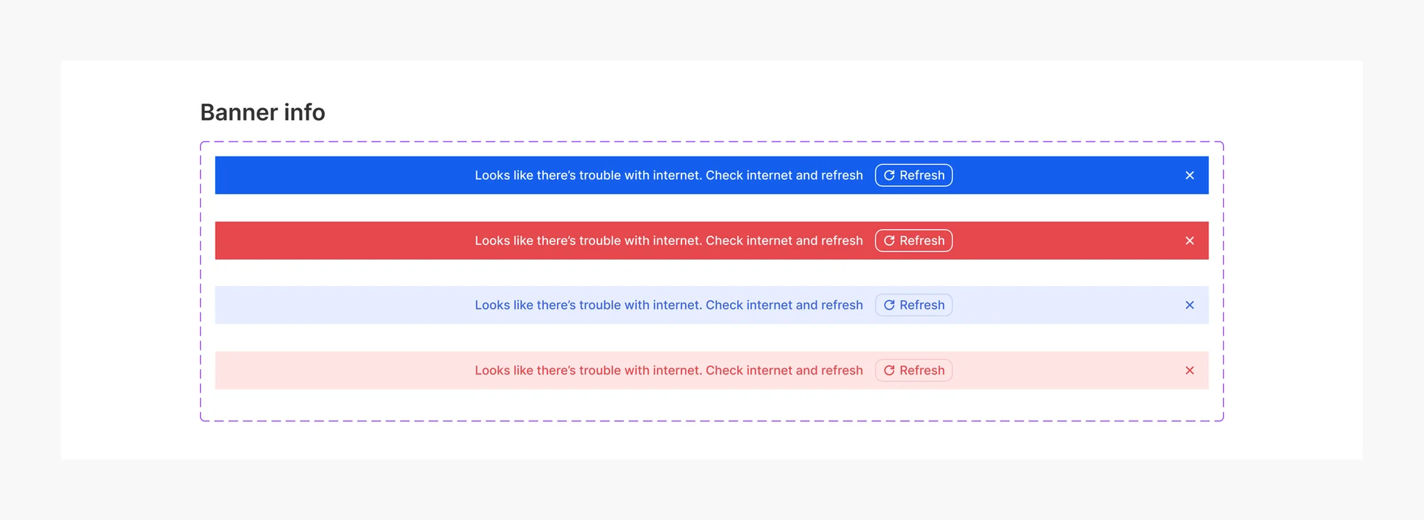
Alerts give every project one consistent way to tell users what just happened. Each alert comes in four states, information, error, warning and success, with or without an action button, so feedback is recognizable at a glance and easy to act on wherever it appears.
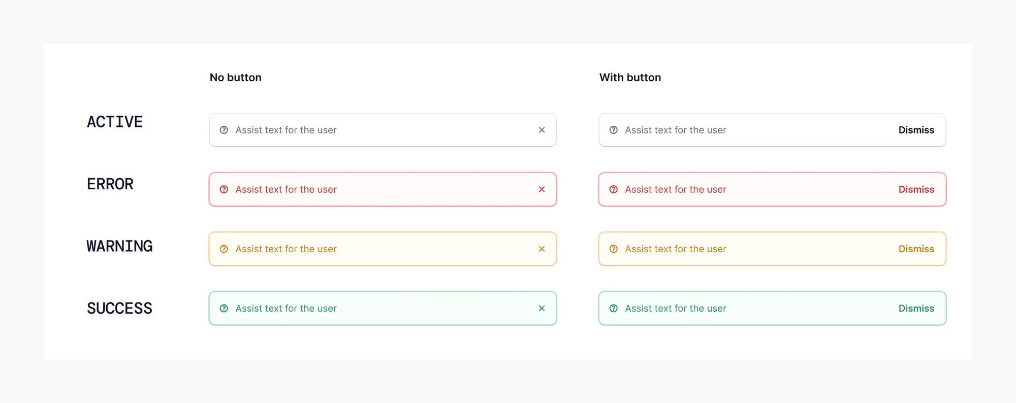
Banner
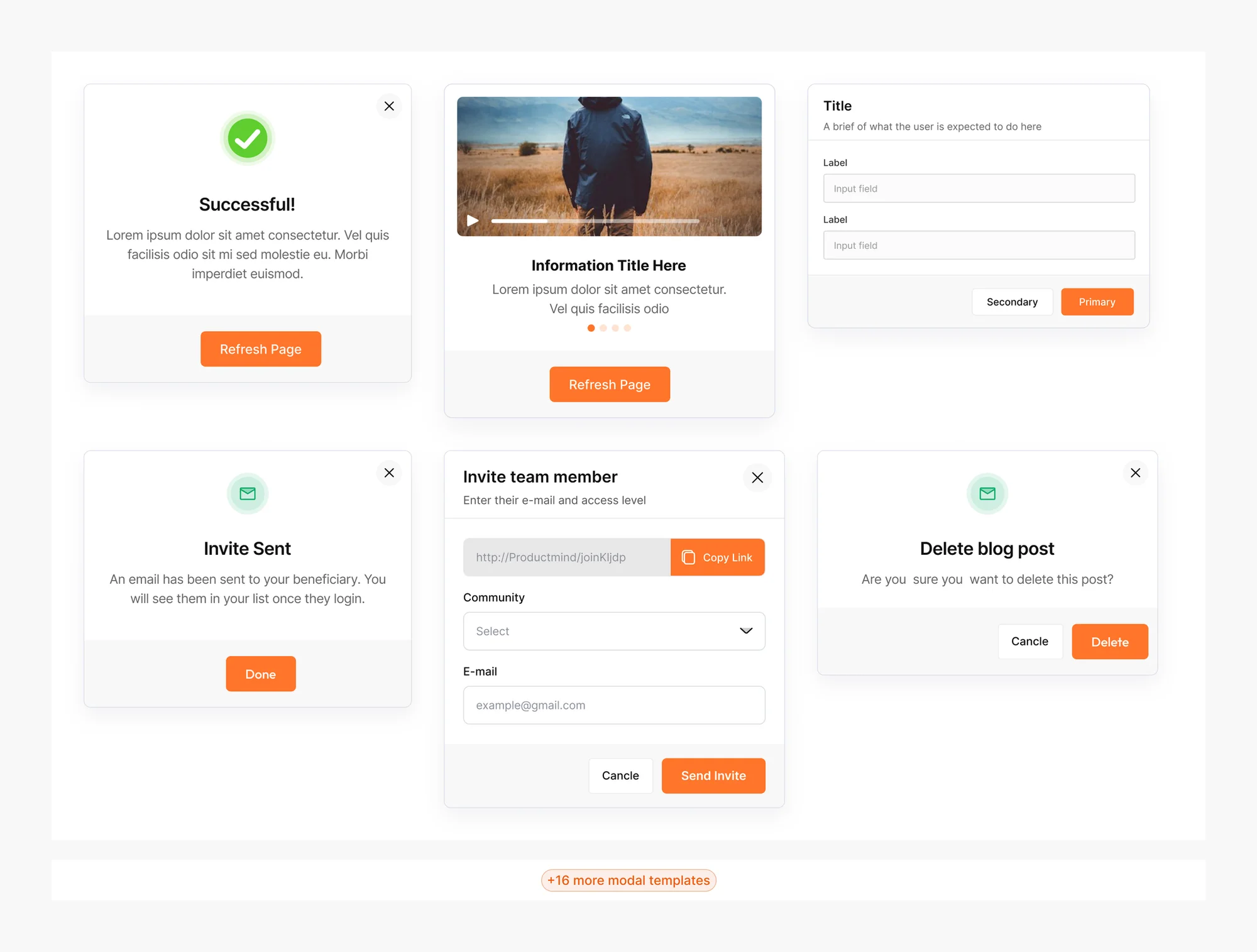
10. Modals
Modals, when standardized, create a consistent on-brand experience for confirmations, warnings, and guided interactions. They make actions clearer for users, reduce friction, and simplify the creation of reusable flows.
Results
- Adoption: Two designers now work in the system, and together they have contributed to 6 projects built with it.
- Faster developer starts: Developers wait less before they can begin work, because the foundations and tokens are already defined.
- Faster design work: Designs take less time to create and ship to developers due to readiness of components to use instead of building from scratch at the beginning of each project.
Next project
Clafiya
Redesigning Clafiya's website, web app and admin dashboard as one system — contributing to a 20%+ increase in conversion.