Health
Clafiya Product Redesign
Clafiya helps people in Nigeria save for and pay for healthcare. Its Health Savings Account (HSA) lets users set money aside, earn 7% interest a year, and spend it on care and wellness for themselves and their loved ones.
- Role
- UI/UX Design, Information Architecture, Art Direction, User Interviews
- Duration
- 2 months
- Scope
- Website, web app, admin dashboard, design system
- Collaborators
- Illustrator, Marketing Lead, Product Manager, in-house Doctors & Nurses
When I joined, the company was growing fast, launching new services and rebranding. The website and product had not kept up. I redesigned the website, the web app and the admin dashboard so they told one clear story and worked as one system. The redesign contributed to a 20%+ increase in conversion.
The Challenge
Clafiya was growing as a health service provider. New services were launching and the company had just rebranded. The website and product needed to capture and communicate those changes.
Three problems stood out:
- The story was unclear. How do we tell our full brand and services story on a website?
- Information was hard to follow. The existing website did not present information clearly to visitors.
- The experience lagged. The product had reported friction, and both the site and the app were behind the new brand in look and feel.
The Goal
The goal was therefore; to communicate Clafiya's growth and new services clearly, improve how existing information is presented, and raise the visual and usability standard of the website and product, using the new brand guide.
Discovery
I joined the meetings where everyone shaping the company's new direction came together: in-house doctors and nurses, customer representatives, the marketing lead and stakeholders. We documented and refined our message until we were confident about what stage the company was at and who we were designing for.
I also interviewed users we reached out to directly. That included people who use Clafiya for themselves, and people who use it to look after elderly parents and younger relatives.
What I learned from users
The interviews shaped the product more than anything else:
- Some people pay for someone else's care. Adult children fund care for parents. Others support younger siblings or relatives. They wanted to help without handing over full access to their money.
- People wanted to save before they needed care. The HSA works best as a habit, so saving had to feel effortless.
- Trust comes from clarity. For a product that holds money and health information, users needed to see where their money was and what it had paid for.
These three insights, shared care, easy saving and clear money, became the mission of the redesign.
The Audit
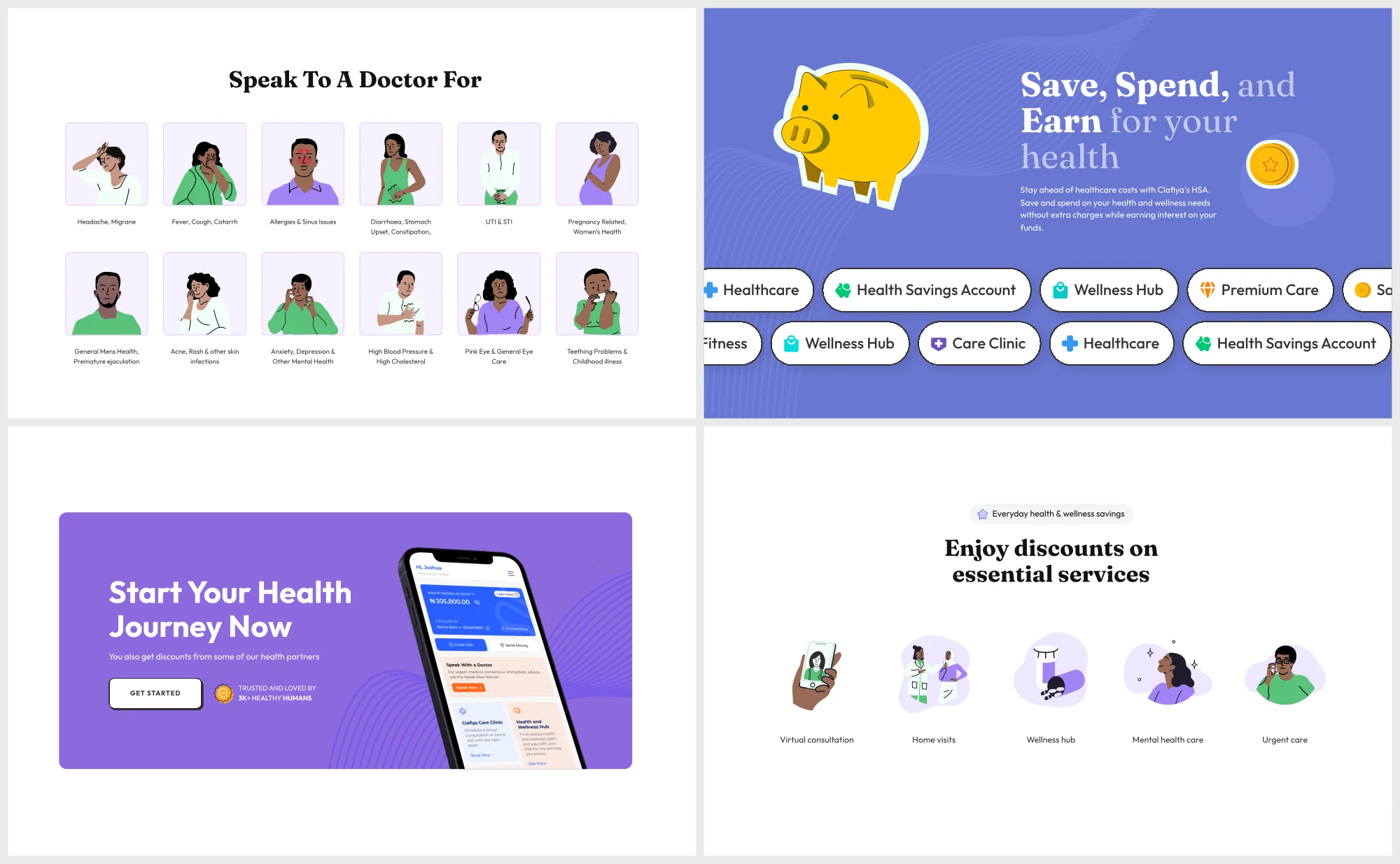
I audited the entire website and three core product flows: booking an appointment, saving money, and spending on care.
The audit confirmed what the reports suggested. Information was hard to find, the flows carried unnecessary friction, and neither the site nor the app reflected the new brand. That gave me a clear priority list before any design began.
Design System & Briefing
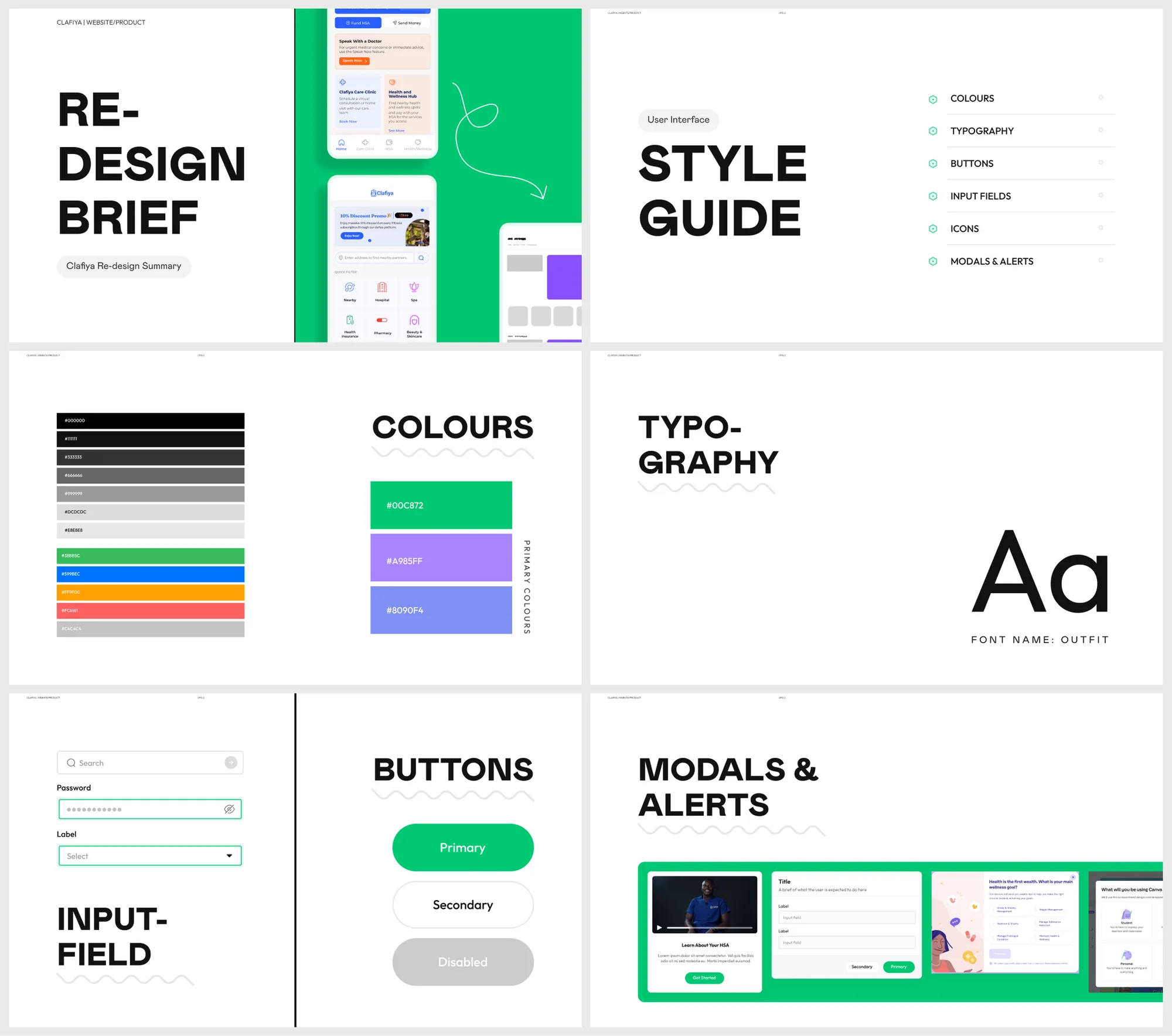
Clafiya's website and product had been built with little or no system. With the business about to enter a new phase, I built one to give the build structure and make future changes easier.
The system covers typography, buttons, forms, modals, sections and more, and the same components are used across the website, the web app and the admin dashboard. A style guide sits on top so designers and developers work from the same source.
The system changed how the team worked. Decisions that used to be made screen by screen were made once, and deliveries came in faster.
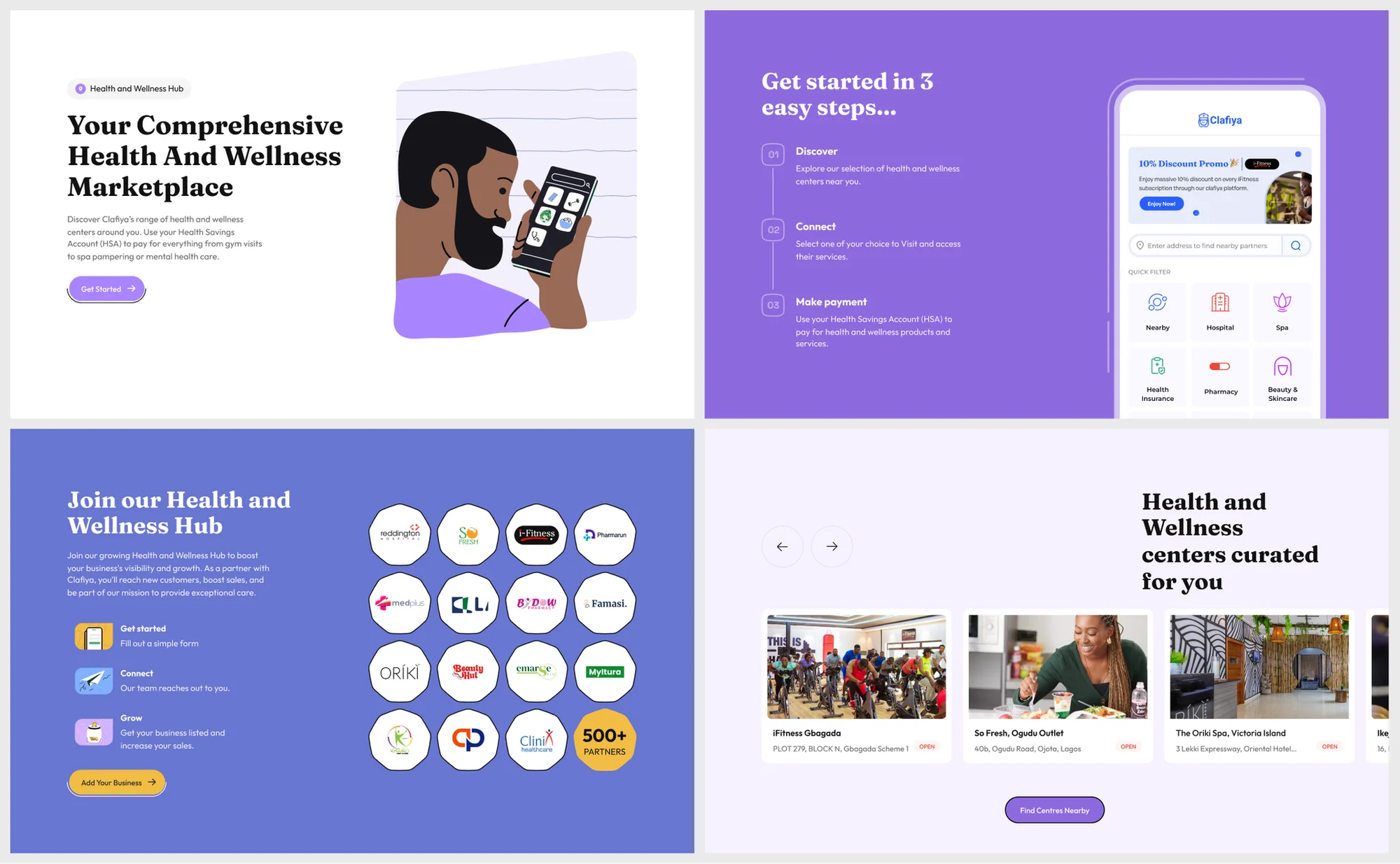
The Website
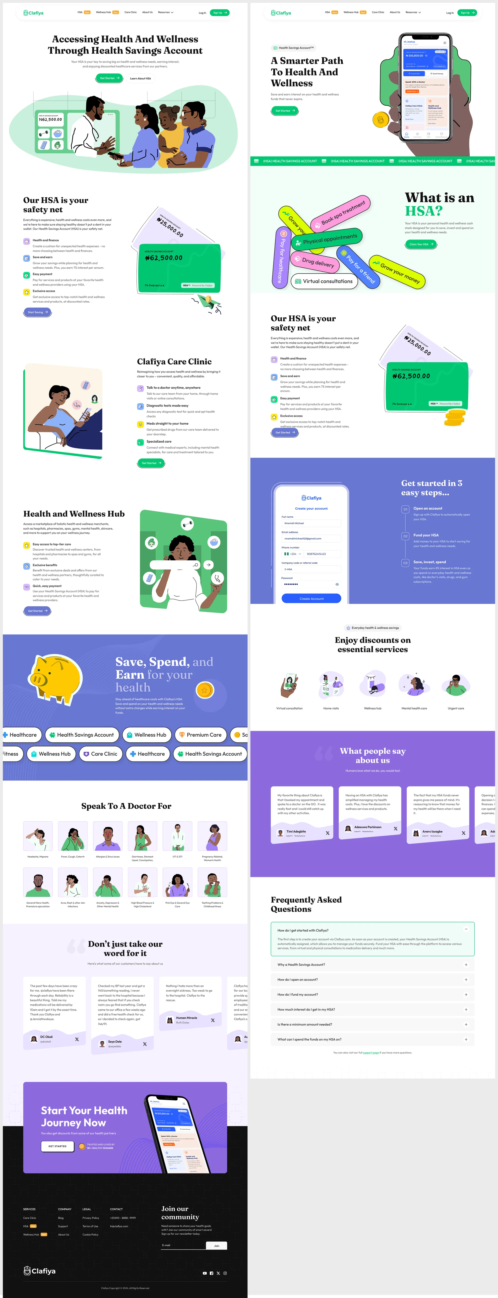
This site uses the homepage for storytelling and summarizing the three major offerings Clafiya provides to its users. Each offering then has its own page to expand on the details and explain how to get started. I led all the design work and collaborated with the illustrator, Marketing lead, Product manager, and CEO on the designs.
The Product
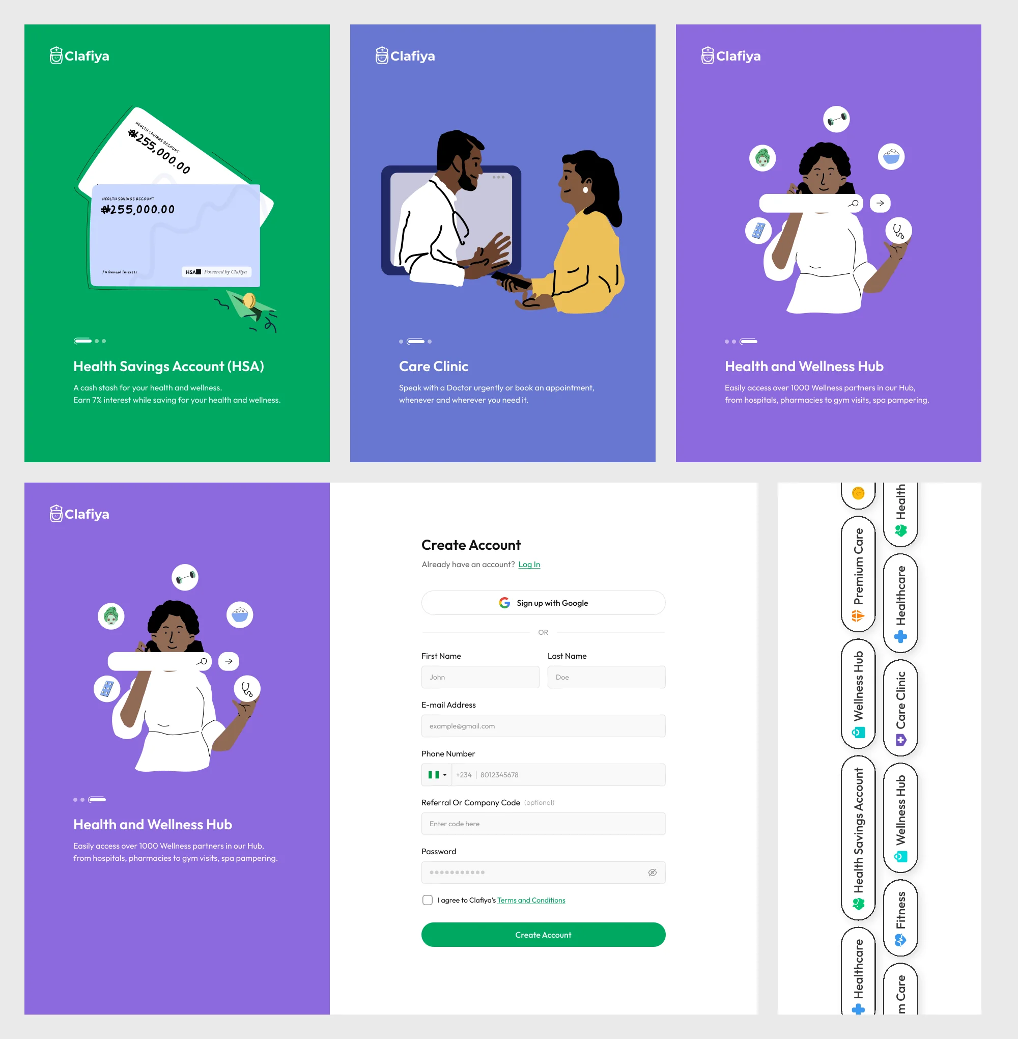
Onboarding
Sign-up is where the product first explains itself. The left panel introduces the HSA in one line and states the value so that users are more convinced to register.
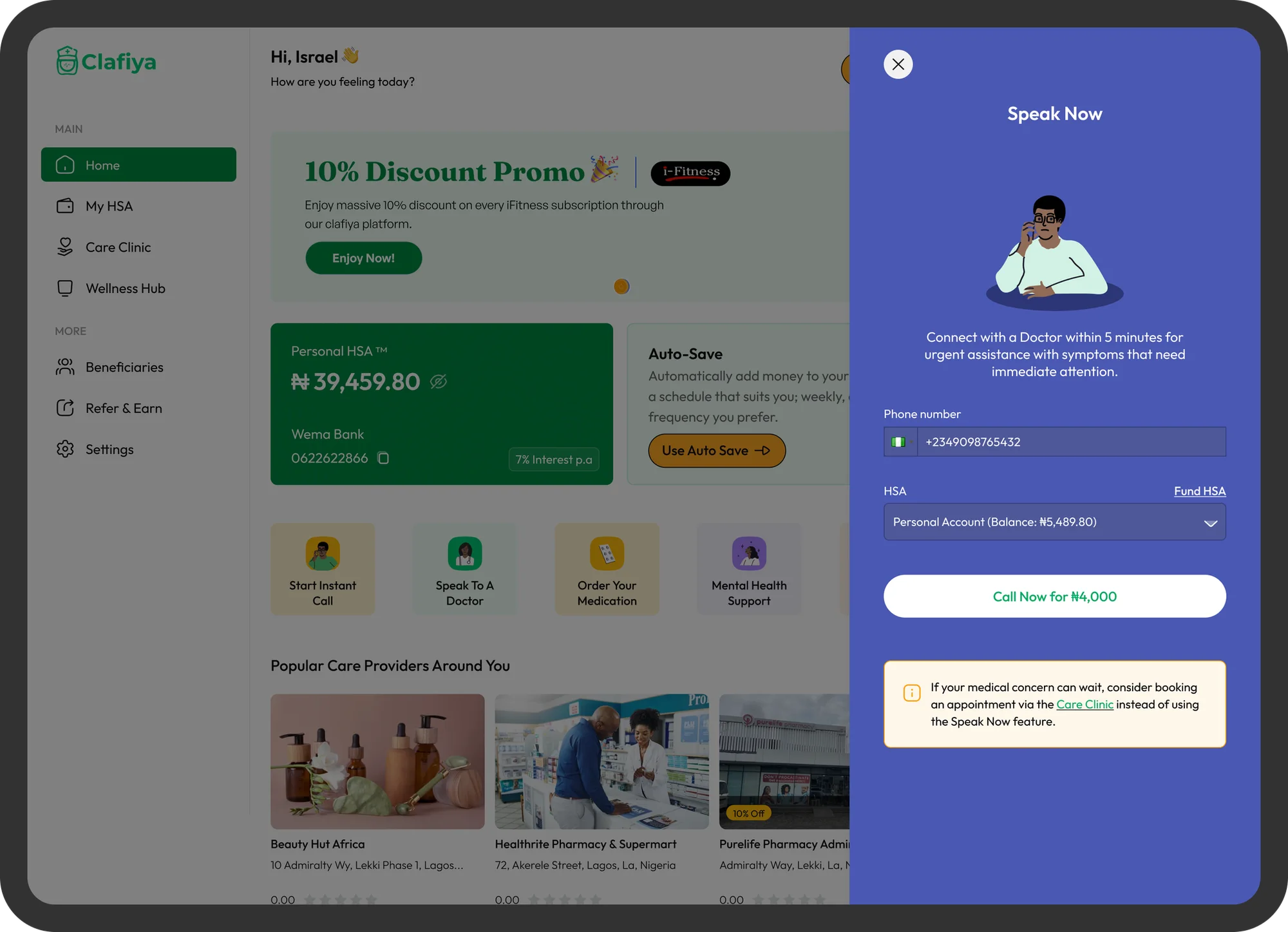
Home and quick actions
I designed the home dashboard to hold the immediate/primary actions users would be most likely to carry, like booking an appointment and including quick links to the care clinic and book a test and others.
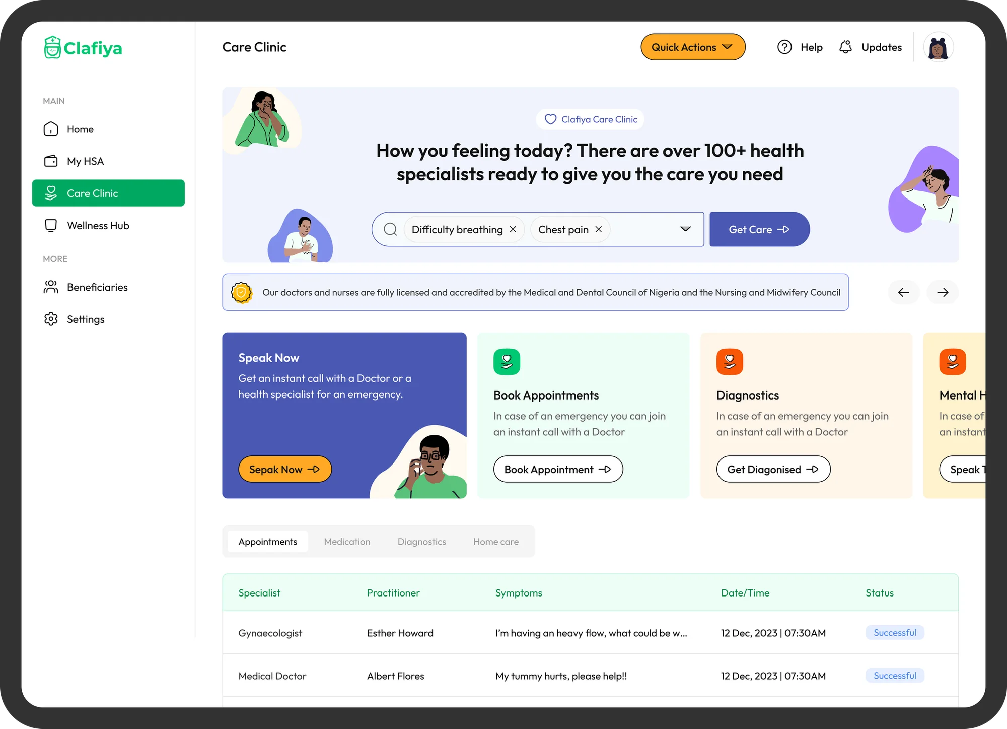
Care Clinic
This captures the booking and records flow for medical appointments. Users can book a consultation and track it through to completion.
Health Savings Account (HSA)
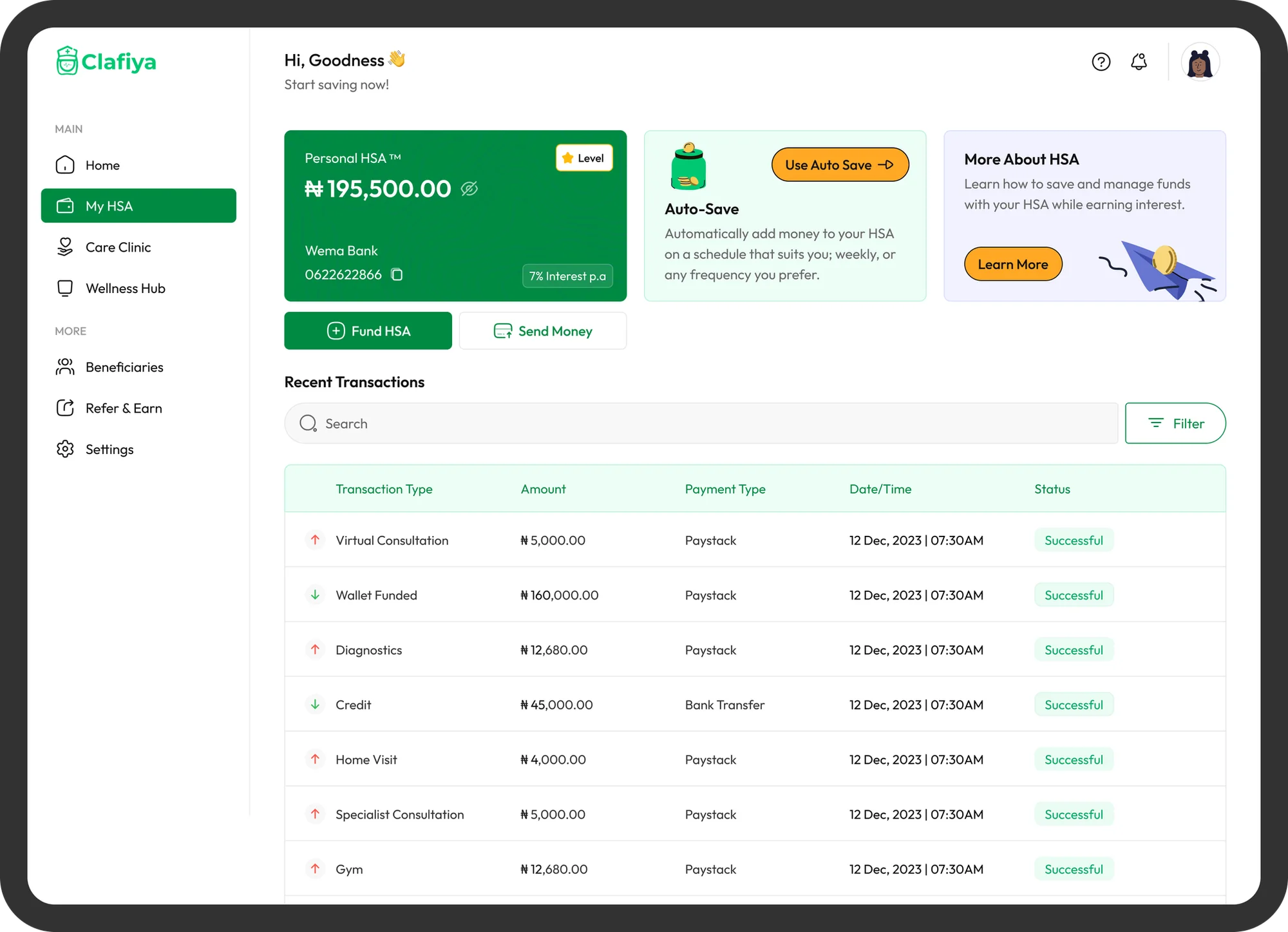
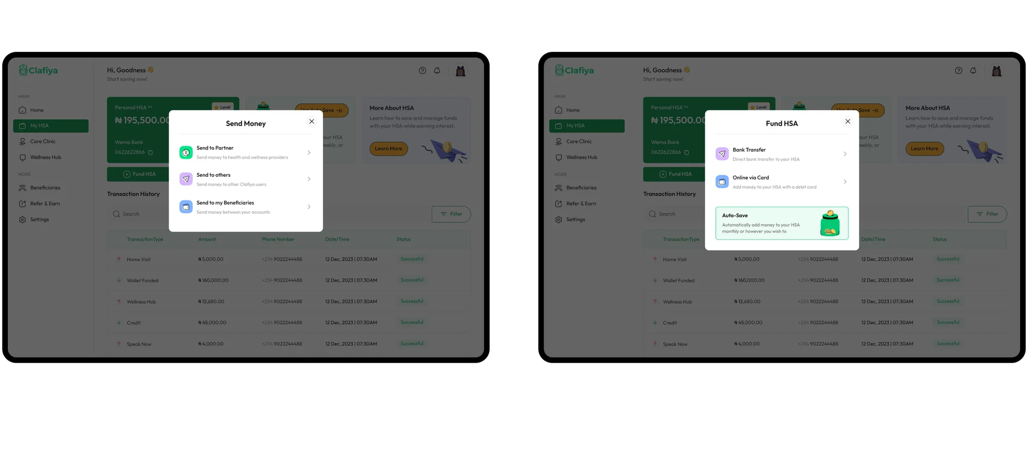
The ‘My HSA’ side account for the financials, balance, account number, interest rate and the two main actions, Fund HSA and Send Money, in one place.
I architected the UI so that Users who sponsor or receive funds from someone else can switch between accounts using tabs at the top. That way, a personal HSA and an assigned one never get mixed up.
Gamification
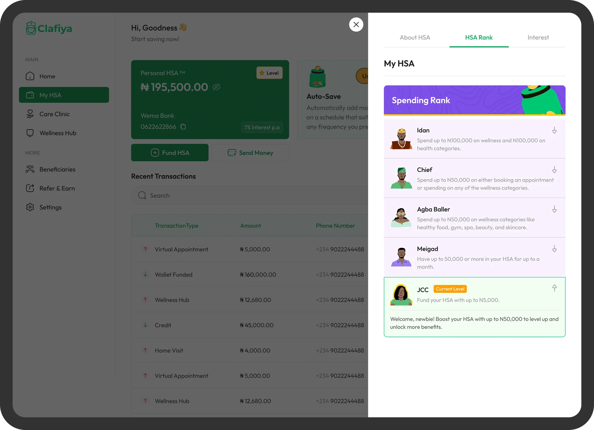
Whilst I designed with utmost intentionality, it was important to include things that would be fun for users to engage: Spending Rank adds a light layer of motivation. Users move up levels by funding their HSA and spending on health and wellness, with clear targets for each step. New users see a welcoming "Current Level" message that tells them exactly what to do next.
Testing
I ran user interviews with Clafiya users we reached out to, including people who use the app for elderly parents and younger relatives. Their feedback shaped the flows for moving money between accounts and the level of control beneficiaries should have.
Results
Customers were excited at the launch of the brands new face/phase. Feedbacks were almost instant and in a matter of months we could track results;
- 20%+ increase in conversion across the redesigned website and product.
- 18% reduction in drop-off
- Faster delivery. The design system and components let the team ship faster and with more consistency.
Conclusion
There are usually complexities when an organization is expanding or evolving. This project taught me how much depends on every person involved having a clear understanding of the changes needed and the direction the organization is headed.
Aligning doctors, marketers, product and leadership early meant two months of design work could carry a whole brand story across a website, a product and an admin tool. The design system gives Clafiya a foundation for whatever it launches next.
Next project
Pradini
Redesigning a premium chauffeur-booking platform for Lagos — the marketing website and the core booking experience.