Marketplace
Pradini
Pradini is a premium chauffeur-booking platform for the African market, starting in Lagos, where high-end transport still ran on personal drivers and WhatsApp referrals. I led design for the marketing website and the core booking experience, from first visit to trip confirmation.
- Role
- UI/UX Design, Research
- Duration
- 4 weeks
The Problem
This Pradini build aimed to fix a genuinely broken market. Vehicle owners were handing ₦30M assets to agents and drivers for a fixed monthly return, with no way to know if their driver was earning far more than they were passing on. They were paying insurance upfront every year, whether the car worked a single trip or not. Agents kept the majority of every fare.
On the guest side, booking a decent vehicle for something that mattered, like a wedding, a board meeting, an airport pickup, meant hours in WhatsApp groups, no guarantee the car or driver would actually show up in the state promised, and no recourse if something went wrong.
- Users didn't understand what Pradini was: The value proposition; verified vehicles, professional drivers, transparent pricing got lost, leaving people unsure how it differed from calling an agent or opening a ride-hailing app.
- The booking flow: Guests booked irregular 3–24 hour windows with pricing that shifted by duration, location, and road conditions, and the V1’s calendar wasn't built to handle that clearly.
The Goal
Redesign Pradini's V1 so users could immediately understand what the platform offered and complete a booking with confidence. This is to essentially replace the current confusing, hard-to-navigate experience with one that made trust, transparency, and Pradini's premium positioning clear at every step.
Workflow
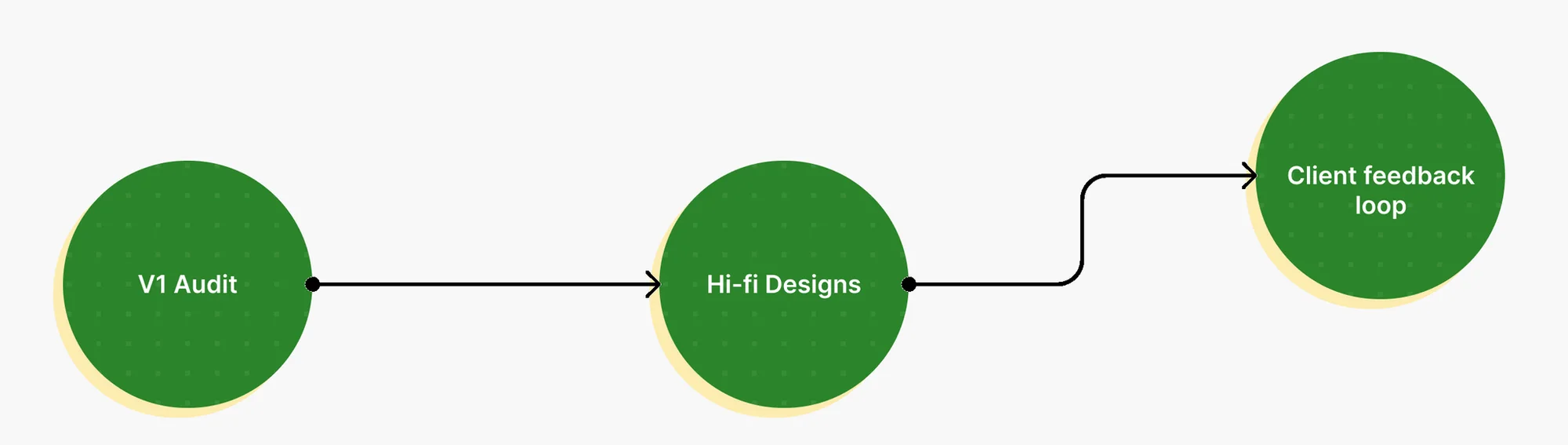
V1 Audit
Auditing Version 1
Before designing anything new, I went through the existing product flow by flow, to identify where users were getting lost, which parts of the booking flow broke down, and where the value proposition failed to come through. This mattered more than starting fresh, because the brief was explicit: this wasn't a blank-slate build, it was a fix. Understanding why V1 confused people shaped a lot of the decisions that followed.
Design
Hi-fidelity Designs
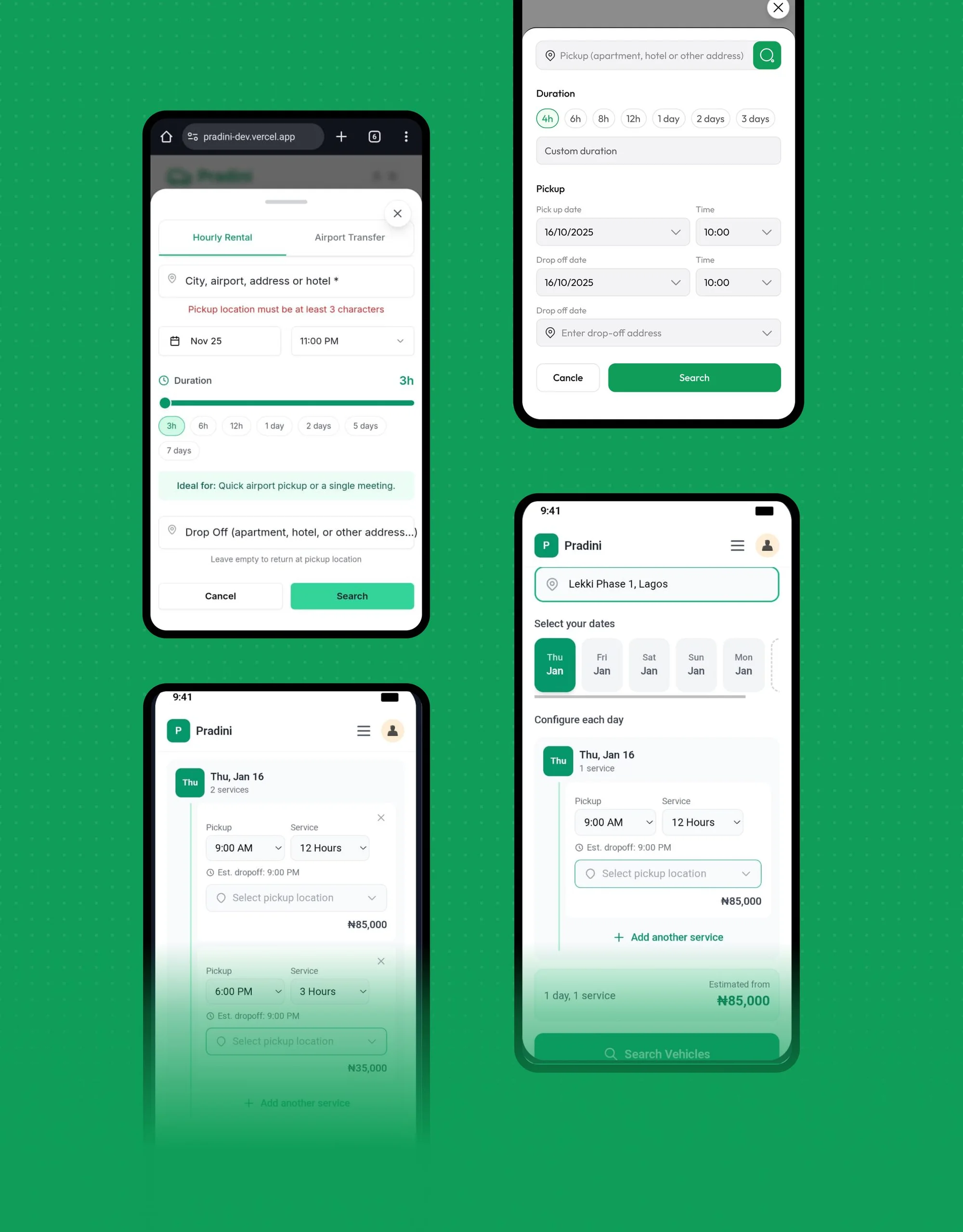
Given the short timeline, the already existing version 1, and the need to move fast, I went directly into high-fidelity design for most part of the project, rather than starting from low-fidelity wireframes. This meant, early feedbacks, and kept the client looking at something concrete from the first review.
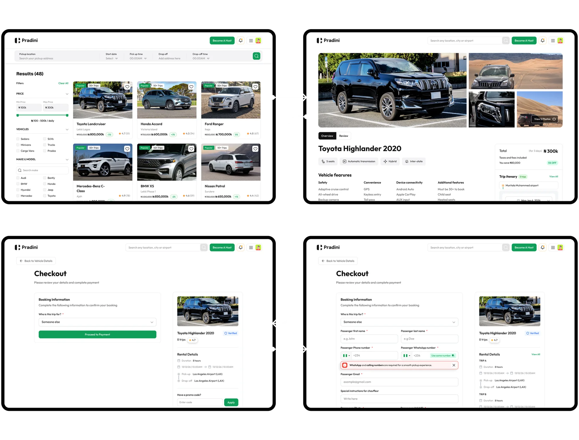
The booking flow
Supporting non-consecutive, multi-duration bookings without confusing the guest was one of the harder interaction problems in the project. The solution had to make selected slots visually unambiguous and recalculate pricing in real time as guests adjusted duration or dates. This was a very different problem from a standard single-date, single-duration booking calendar.
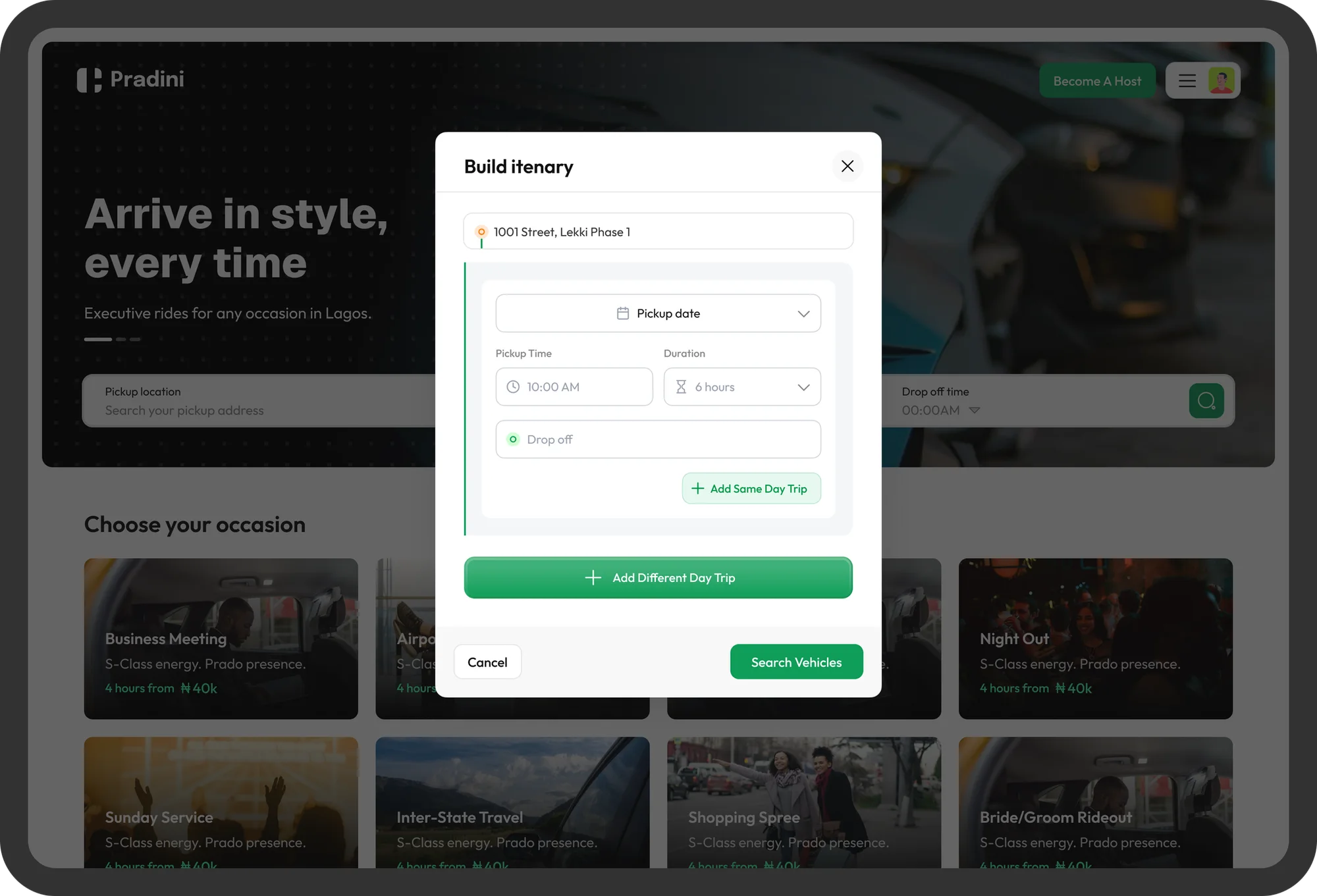
Solving multiple bookings
multi-duration bookings was one of the harder interaction problems in the project. I designed the interface such that users have no confusion booking a single trip and can also in the same space of being aware of the availability of multiple bookings, build their itenary at the same time.
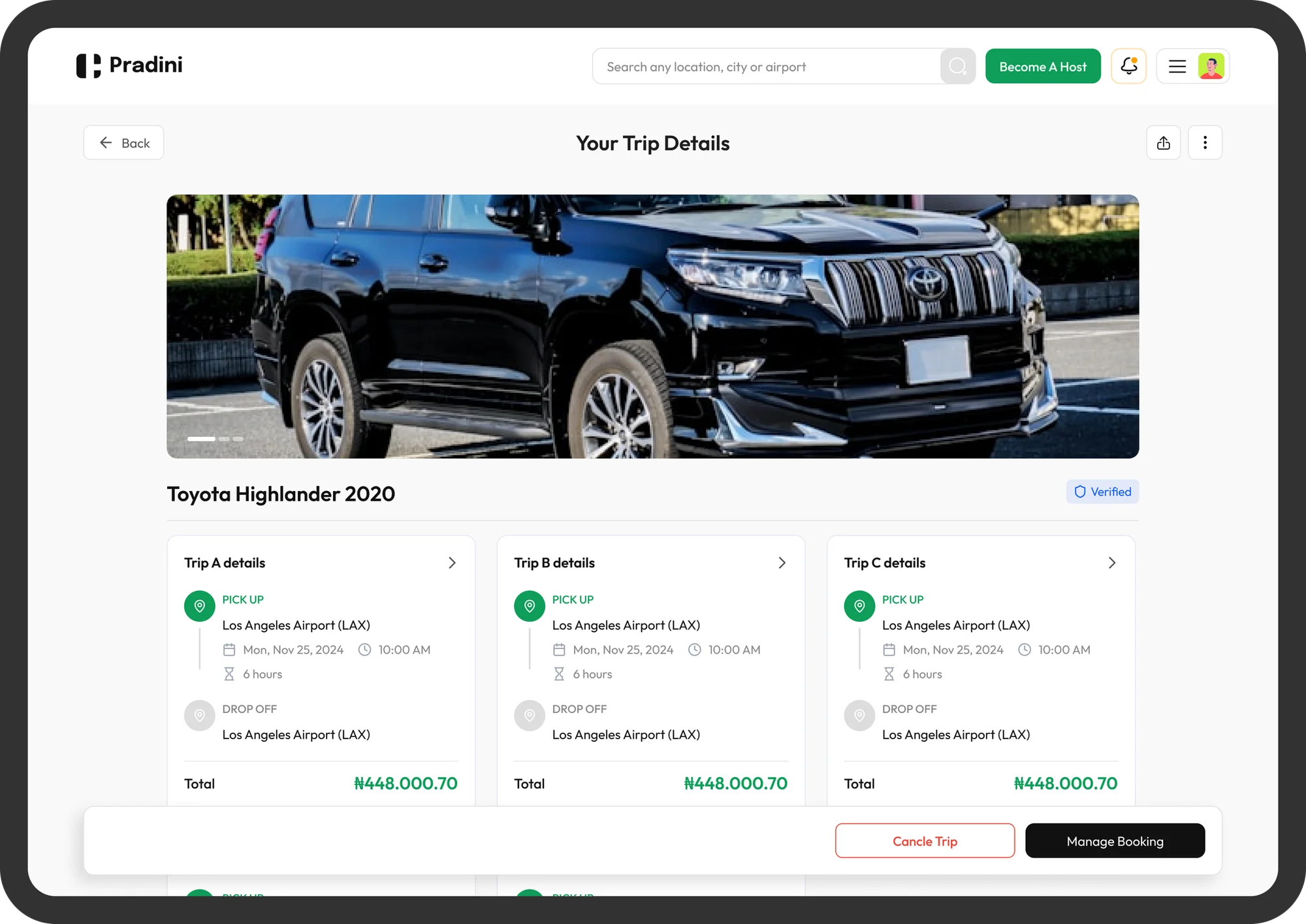
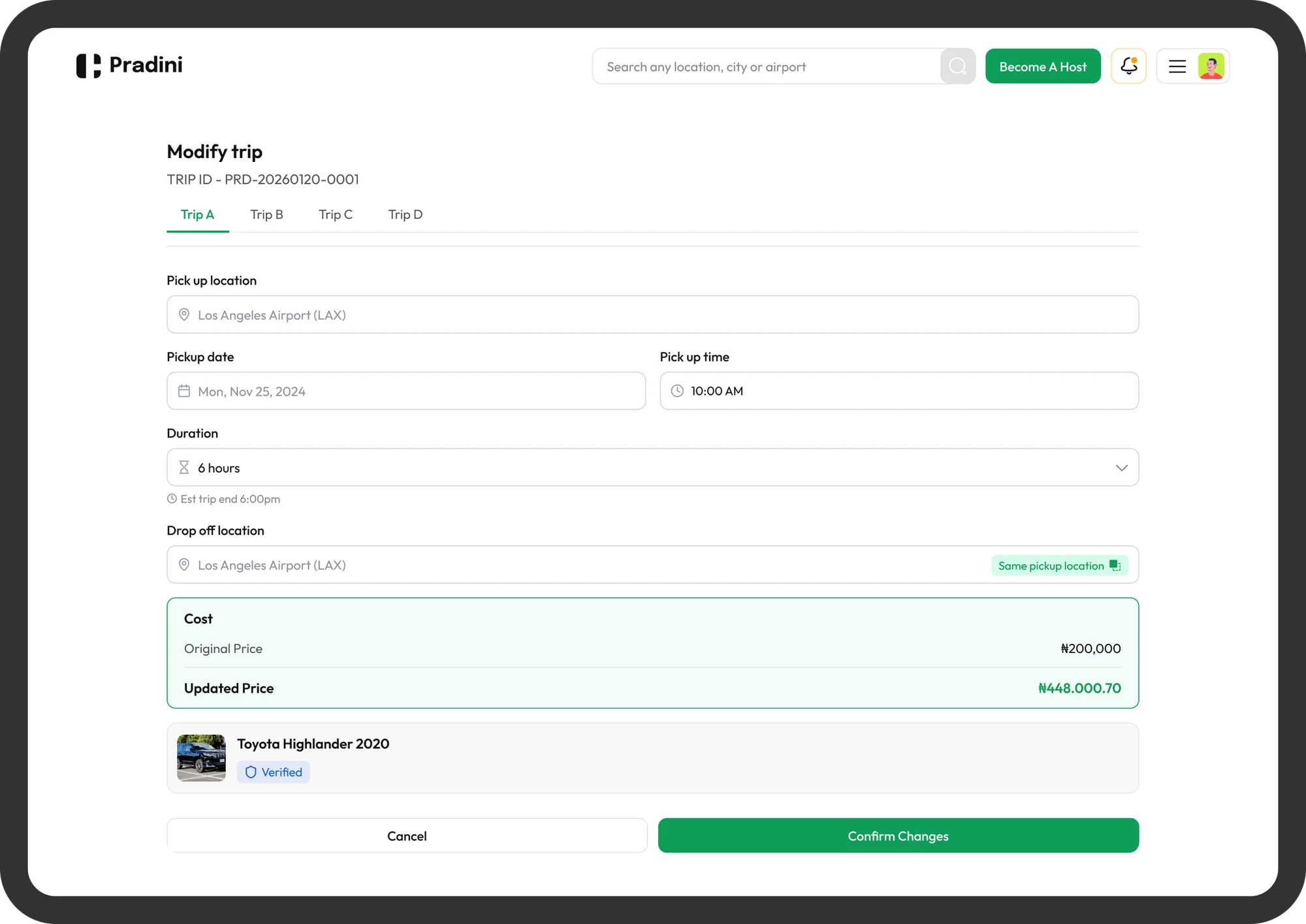
Managing multiple bookings
The design also needed to account for making changes to a booking or the bookings, like changing a car or time.
The marketing website
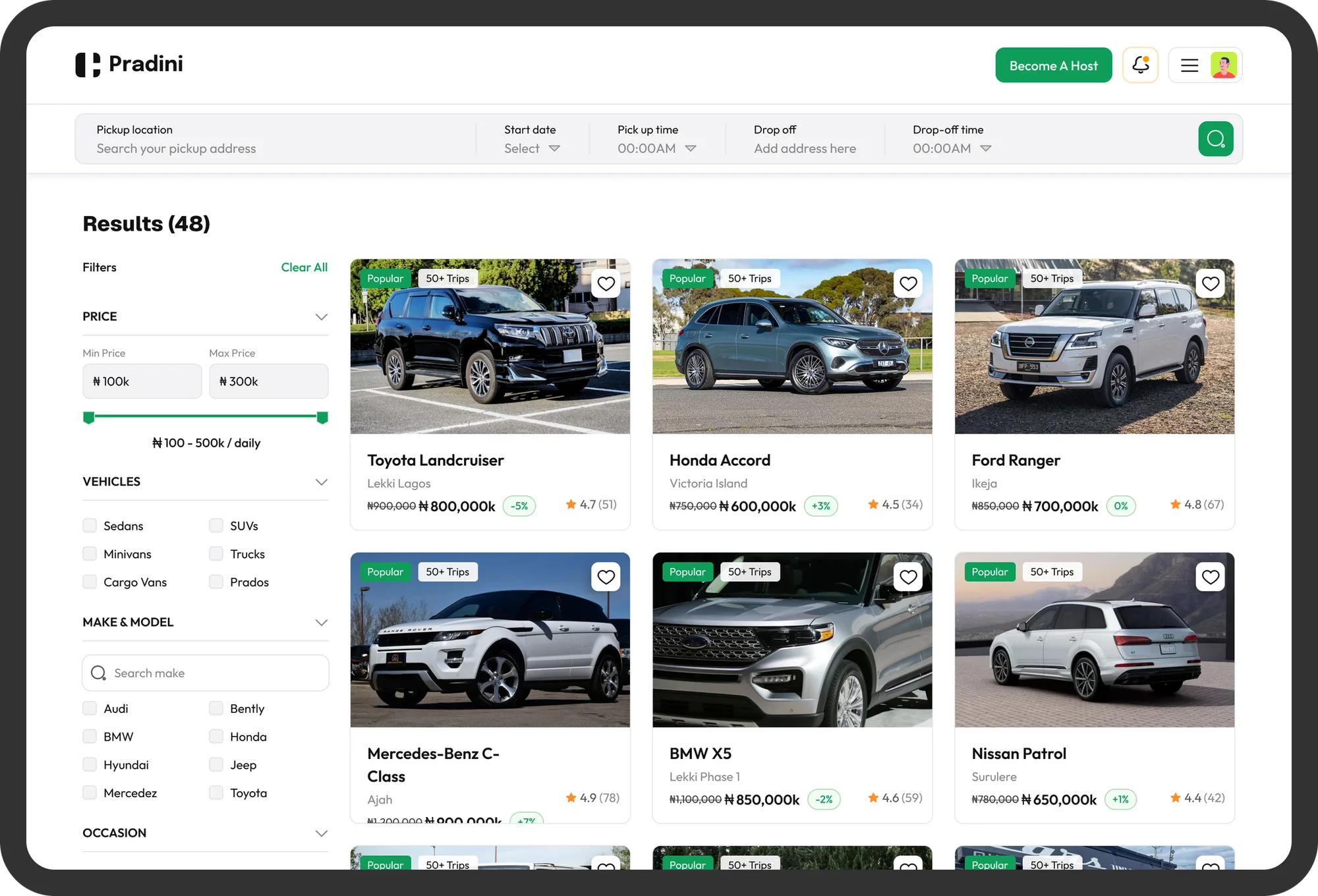
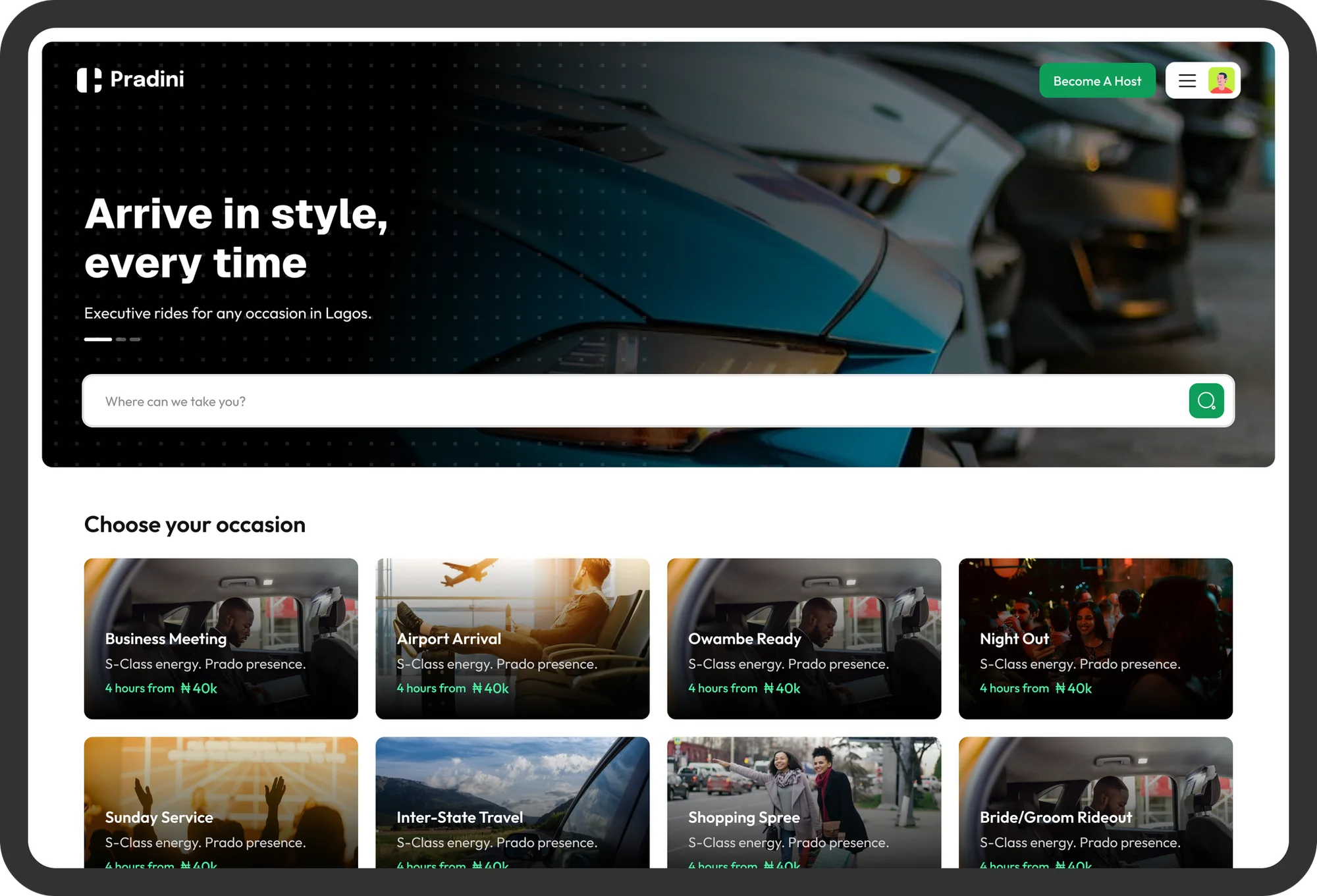
Alongside the product redesign, I designed the public-facing marketing website the first place most guests would form an opinion of whether Pradini was legitimate. It needed to establish Pradini as premium, safety-first, and built specifically for the moments Nigerian users actually book vehicles for; weddings, Owambe, business travel, airport arrivals, rather than as a generic ride-hailing platform.
Feedback
Feedback loop
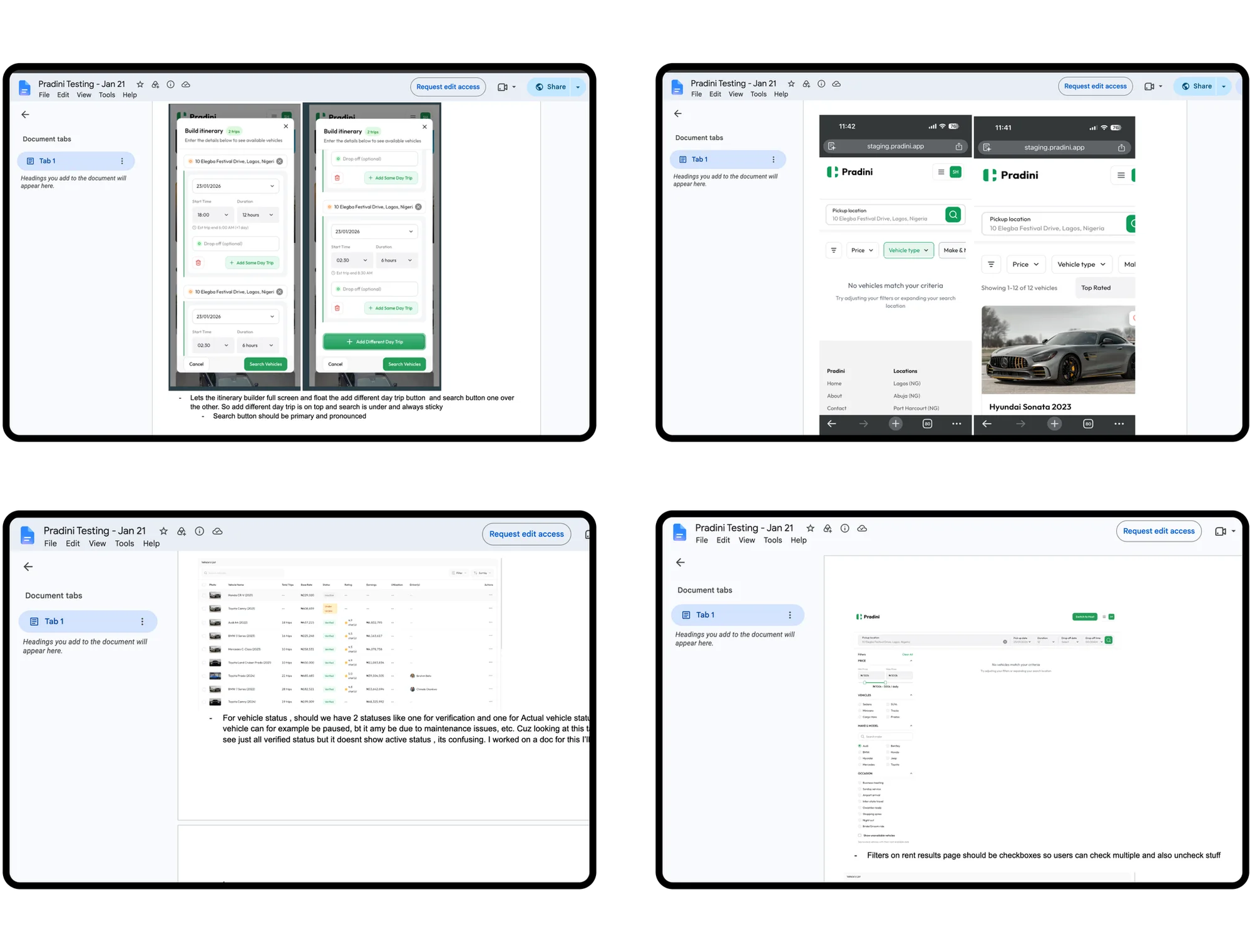
Given the pace of the engagement and the client's own familiarity with Nigerian booking behavior, feedback came in whilst the project was ongoing. Each batch of screens went out for review, came back with notes on what would or wouldn't land with guests and hosts in Lagos, and got revised before moving forward. This tight loop let the redesign stay grounded in real market context even without direct access to end users.
Conclusion
The hardest part of this project wasn't any single screen; it was holding three very different users' trust requirements in mind at once, in a market where trust had been the entire missing ingredient.
Next project
Cavalry
Designing an AI-powered community manager that automates the busywork, deepens engagement and drives growth.